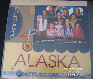
Today I wanted to mention a few other things I did to the layout. The first thing to mention is the paper packet used for the layout is Surf's Up. The default colors of Surf's Up are Chocolate, Crystal Blue, Ponderosa Pine, Sorbet, Surf's Up Gold, Surf's Up Teal, and White Daisy. These were not going to work with Disney Colors! Tommy paper packet colors -- Cranberry, Desert Sand, Honey, and Outdoor Denim -- were a much better choice. However, I didn't want the nautical patterns of Tommy, and I liked the paper from Surf's Up better. Surf's Up will fit the vacation pictures much better because there are more pictures then just the ocean.
I loaded the Surf's Up paper for my pattern of choice. Problem solved by changing the colors of the paper!
The patterned blue paper used to be shades of teal. I wanted this paper to represent water, but, as you can imagine, wouldn't go with my pictures as teal. Similarly, I changed the color of the paper to the left (Surf's Up Gold previously) Honey, and to the right Outdoor Denim. And finally, I added Desert Sand and Bamboo to the mix.
For the buttons, I made them a mix of colors because I wanted one more point of red on the page (triangles are pleasing to the eye and I had two chimney stacks in the picture). The Cranberry button helps with the other dots of red. But if I had all three buttons Cranberry, it would have been too overpowering. That's why I changed the colors of the other two buttons. The Honey one helped with the triangular look and the Outdoor just looked right. Don't be afraid to experiment as you create!
 Something else I'd like to point out is the stitching along the curves of the Outdoor Denim. You can see it well in this picture -- look under "Destination". Stitching can be added but doesn't have to be.
The flag cluster was added after I received my layout -- they are Tommy Assortment -- therefore I didn't have a choice of color, so my other color choices were based on that cluster (I knew I wanted to add the cluster while I was putting together the layout).
The final technique I wanted to share with you for this layout is with the under the flap picture.
The layout came with three photo wells at the bottom of the layout. I wanted to showcase the interaction of the cousins with Grandma more, so I wanted a larger picture. To achieve this, I dropped the same picture into both photo wells and enlarged them to the desired size. Then, I moved the pictures in the wells so that they overlapped. Whalaa -- you have one large picture!
The flaps (there are two 3"x3" ones) were added once I got the layout back. Those pictures were slipped into the flaps which were then adhered to the layout.
Nice? Nice!!


No comments:
Post a Comment