Showing posts with label Convention Submission. Show all posts

Sunday, February 16, 2014

A Gift for a Young Girl


Today's entry is about a young girl in your life;  a friend's daughter, niece, or granddaughter.  If she enjoys dressing dolls, this will be a perfect gift for her.  It doesn't take a lot of space and it's portable.   What am I talking about?  You creating a magnetic doll and clothes complete with container!  It's simple.
Paper Doll (D1547) is the ideal stamp set to use for this.  As you can see, you get a girl, three outfits,, a hat, headband, and some accessories (there are a total of 12 stamps).  I stamped the shorts outfit more than once and cut out just the purse for some additional choices.
As you can see, I stamped the hat several times too.  I wanted hats to match the outfits the girls could wear.  Below is a further closeup of the clothes.  I colored the girls and the clothes with our Watercolor Pencils after stamping on White Daisy cardstock.
Once I colored everything I ran the paper through a Xyron magnetic/laminate cassette.  Then I cut everything out.  When you look at the stamp set, you'll see the outfits have tabs (to fold over the girl -- you remember yours growing up?!).  Since mine were magnets, I cut the tabs off.
In this last picture you see some background scenes.  Those I found online, printed out, and threw them through the Xyron too.   The last thing I did was paint a little metal lunch box to put everything in.  Both the scenes and girls fit on the outside of the box, and it's ready to travel in the car, in the living room, or the yard.

When you give this gift, your special girl will entertain herself while using her imagination.

Another example is the one in the Spring/Summer 2014 idea book on page 104.  There you'll find a similar idea with just paper.   Of course, Corporate took it a little further with the tree, table, and fence.  Either way you go, you'll receive an enthusiastic "THANK  YOU" from your special girl.  : )

Thursday, May 23, 2013

Fabric Flowers

The other day Stacy showed us how to add For Always Fabric to a layout.  The fabric added even more dimension to the layout.

I made 3-D flowers and a mason jar top with my fabric.  I also used the fabric for the leaves.


Okay, I have to tell you that it was my intention to cut the fabric out with my Cricut.  One thing I learned from the experience was you need to have a sharper blade to cut through fabric.  Since I was on a time crunch, I instead cut out freezer paper.  Once the freezer paper was cut, I ironed the paper to the fabric and then cut out the fabric flowers with fabric scissors.  Once I rolled them, I sprayed them with starch -- they didn't really need to be sprayed, but I did.  The opaques were glued in with Liquid Glass.  In fact, everything was glued on with Liquid Glass.

We made something very similar to this at our Spring Fling Workshop that was May 4th, 2013.  You should have seen those pictures already.

What was in the jar?  Cookies in a jar mix.  Potatoe chip cookie mix to be exact.  They are quite good!

Saturday, February 16, 2013

Graduation and Wedding Money Flower Pot

Yesterday I showed you the graduation money flower pot for Paper Cupcake's Blog Hop.  Today I want to share the sizes and techniques I used to create the "garden."

Graduation Bouquet


I am going to be sending this to the Close to my Heart Corporate office.  I hope they enjoy it.  Oh, and just so you know, I'll be sending fake money.  ;-)

The "f" key is the star today.  This is found on page 54 of the Artiste booklet.  I like to note where on the Cricut keypad any key is located using a Column Row numbering system.  So for most of these images you'll find the key at Column 5 Row 4 or C5R4.

The pot (3D Object) was cut at 6.25" which, when it's put together, will be 2.5" high.  It's not that big, but you know big things come in small packages.  As I mentioned yesterday, our two sided background and texture paper are ideal because of the contrasting lip without any extra work.

The single leaf is from Accent 4 and sized at 0.75".  I cut two leaves per flower.  The vine was cut at 1.75" and is found on 3D Object <shift>.  I think 6 vines fill in the pot well.

The flowers consist of three flat flowers from Accent 3 <shift> sized at 2.5" (cut two per flower), 2", and 1.5".  The center of the flower is the spiky 3D flower from Accent 1 <shift> and measures 3".

Last prep is cutting the congratulations from the Art Philosophy Cartridge.  The image is from one of the three stamp sets included in the bundle.  Found at C1R2 (and page 30), the <circle2> was cut at 1.75".  The background  and texture paper was cut at 2".

Wedding Bouquet


On to assembly:

Money ~
The individual bills are rolled longwise.  I made them as tight as I could knowing they would loosen up after I tied them.  But in order to tie them, I placed a paper clip at each end of the rolled bill.  I tied 9" of Twine around the bill and then removed the paper clips.

Flowers ~
You want to glue 4 petals of the 2.5" flat flower together.  This will form a pocket for the money to slide into.  Make sure you only put glue on the petals or you won't be able to slide the money in.  I then sponged all of the flowers, including the 3D flowers.  Form the 3D flowers into, well, 3D flowers, then glue the 3D flower to the flat flowers.

The graduation flowers I left plain.  The wedding flowers I jazzed up a bit with Opaque Pearls for the center.

Single Leaf ~
I attached them to the money with one glue dot per leaf.  Money is made from paper so there was no problem getting the dots to stick, and they came off too.

Vines ~
Four of the vines I glued directly to the pot edges.  The remaining two I placed into the pot along with the flowers.

Extras ~
For my graduation pot, I used 24" of Cranberry twine for the pot.  I liked having something tied around the pot, but it isn't necessary.  The wedding pot, on the other hand, I dressed up with Color-Ready Ribbon colored with Honey.  The ribbon would not stick to our Tombow tape runner.  It also doesn't stick really well to glue dots.  I didn't want to use Liquid Glass because that would leak through the ribbon and show.  What worked well was Scor-Tape (red tape and the likes should work equally as well).

Congratulations ~
I kept with the round theme and used the stamp I did.  For the graduation card I only added two bitty sparkles to the word dividers (I don't know if that's what they are really called, but it's obvious where I put them when you look at the stamped image).  The wedding ensemble was dressed up with a Black Glitter Button tied with Black Hemp to the skewer.

Wedding dressed up with a bow tie


Making everything stand up:
I put bird seed into the pot and put the flowers and extra vines into the pot.  We are done!!

Summary:
Graduation Wedding
Pot Paper Scholastic For Always
Flower Cardstock Cranberry Honey
Flower Sponge Color Barn Red Goldrush
Leaf and Vine Cardstock New England Ivy Olive
Congratulations Color Cocoa Black
Twine Color Cranberry Creme Brulee


Wednesday, April 27, 2011

JOY block

The last side of my project is for winter time.  Because of the colors and word, I can display it for several months.  And in California, you have to remind yourself it's still winter -- even in January.  Tee hee.  :)

But, Dana, there are only three letters in the word "joy" and you have four blocks.

Never fear, my friends!  That's why we have dimensional element snowflakes!!

Here I used a the blue hues of Miracle paper packet to compliment Petal.  It was a joy working on this word (pun intended... and the drum sounds).  In fact, I was in Mammoth among lots of snow while working on this word.  Each letter is outlined with fun flock to make it look like condensation on a "window".


 Glitter was added to several rows of Ready Color Borders for a snow mound (alright, so it's a small mound).  The Shimmer brads finishes the letter.
 Clear buttons and colored floss help with this letter "O".  The hard part of this whole project is to have a different look for each of the letters.  By the time I got to this word, I asked myself often, "what haven't I done yet?".  By adding lots of different sized buttons, all on one side, change the look from, say the "O" of Hope.
 Another simple yet elegant letter.  The brads set the letter off and combined with all of the blocks, it lets the reader know that it's the end of the word.
Finally, I embossed the snowflakes in white in the background.  I wanted the feel of lots of snow (since there was a ton of it).  Some of the snowflakes I went over with petal ink to spread the color around more.  And I sponged the snowflake with Pacifica ink.

And there you have my major submission for convention.  You may have already seen some of the cards and my layout.  If not, you can click on Labels: Convention Submission (below) and see everything I've posted so far.  I think I am only missing two more items... but I'll save that for another night.  I'm going to bed.  :)

LOVE block

Did I mention I was chosen to teach at convention this year?  After four years of trying, I got help from my upline, and submitted something worthy of CTMH.  I'm really excited and nervous!!

The third side of my blocks highlight the word "LOVE".  This is another word that can hang out on the mantel year round.  This word uses the Sweetheart Paper packet, sponging around the all papers with black ink.  The letters L, V, and E use the back side of the striped paper.  The O has three other papers in use.  Let's dive a little deeper...


 Another simple letter.  I used the red assortment sparkles and Cranberry ribbon here.
Here, I layered dimensional heart elements on topf of each other.  I got this idea from Pnina and a card swap she did at Kay's meeting (thanks, Pnina).  :)  Because of the high layers, I put foam tape underneath to retain the level of the letter.  The black is all from the black mini-medley accessories and include a button, brad, ribbon, and corduroy brad.
 Here the Just Blooms flowers take center stage even though they are in the background.  This paper is wonderful because Tulip (here) and Cranberry (letter L) both look great!  The heart is a dimensional element covered in B&T paper.
Another simple letter.  :)  The flower is from the Red Button Assortment and the tags are from the black and tulip mini-medley.  White hemp is tied in a bow.

WISH Block

The "i" of this word is my favorite.  You know how you get an idea in your mind and you work at it until it looks the same in reality as in your mind?  Well, I usually have to settle because it doesn't always work out the way you want.  This one is an exception!

The WISH block can be used for birthdays or any celebration (like the Fourth of July), which is why I used the Fanfare paper packet.  The letters have cardstock that I spritzed with a mixture of pearl paint and water. 


 Nice and simple.  The ink is White Daisy which is a pigment ink.  I set it with our craft heater, and tied it on with white embroidery floss.
 The cupcake frosting is our liquid applique.  I let it dry over night so it would be a smoother finish.  I then added bitty brads to look like those little balls (I can't think of the proper name for them).  The wrappers are stamped on white textured cardstock and mounted in the middle.  The flame is two layers of dimensional element stars.  The bottom layer is sponged in buttercup ink.  The second layer has a star from the B&T paper, rotated, and the top layer is a cut out star.
 The S used Fanfare's My Stickease for the banner. I cut the border to make it sag a little. I then added a brad between the two pieces so that the banner is being held up by the brad. Okay, I'm a little crazy so I cut out a star from the B&T paper and glued it onto the brad.


Buttons, My Stickease, and a Canvas button with a cut out star make for excellent balloons for this letter.  The strings are waxy flax.

HOPE blocks

You may have watched my video, well, now it's time to see the blocks up close.  I took four My Creation Cubes and created words on each side.  This one is HOPE.

For this side, I used Mayberry paper as my choice of paper.  I sponged with cocoa around each of the letters (I kept them white) and the papers.  The "P" is stamped on in Olive ink.


I'd list everything I used except that it would take me quite some time to look everything up.  I figure it's the general idea that is more important.  If you'd like to know exactly what I used, you can email me at dskdots@san.rr.com and ask specifically.  :)

A Tweet Card

Here I wanted to show two things.  The first is adding a second color to a solid stamp (see the stomach) and that cut out items don't always have to go on top (see the branch).


How do you accomplish the two tone bird?  First, you need to twist, twist, tap, tap, tap your solid stamp in the lightest ink pad (Creme Brulee here). Next, take a sponge dauber (or tissue paper for texture as I did here) and sponge with a different color ink (Sunset here) onto the inked stamp.  It's best to work quickly, but you can always give your stamp a huff to bring the moisture back outward before stamping.  Once the image was stamped, I took a  marker and used the fine end to draw in the legs and feet, and the beak.

For some reason I enjoy cutting small details.  How do I cut into small areas?  I use our micro-tip scissors which give me GREAT control.  I start cutting, usually a little way from (and going toward) the detailed area (the feet here).  That way I have a lot of paper to hold onto while I move the paper.  Notice what you just read?  I move the paper around my scissors, not the scissors around the paper.  I will adjust the scissors so they are more open within the detailed areas.  I find the back to middle of the scissors give me more control than the tip.  Again, I move the paper around my scissors until I'm past the detail area and then use more of the scissors with each "stroke."  I applied the same technique for the branchs and flowers.

All Products CTMH:
X7128B  Olivia Level 2 Paper Packet (background and texture paper)
X5754    Creme Brulee Cardstock
X5642    Cocoa Cardstock
A1104    A Tweet Stamp Set
Z2114    Cocoa Ink Pad
Z2167    Creme Brulee Ink Pad
Z2191    Sunset Ink Pad
Z2137    Olive Ink Pad
Z2214    Cocoa Marker
Z2203    Bamboo Marker (beak)
Z534      Micro-tip Scissors
Z1333    Mocha Opaques Adhesive Gems
Z1151     3-D Foam Tape (bird)


Tuesday, March 22, 2011

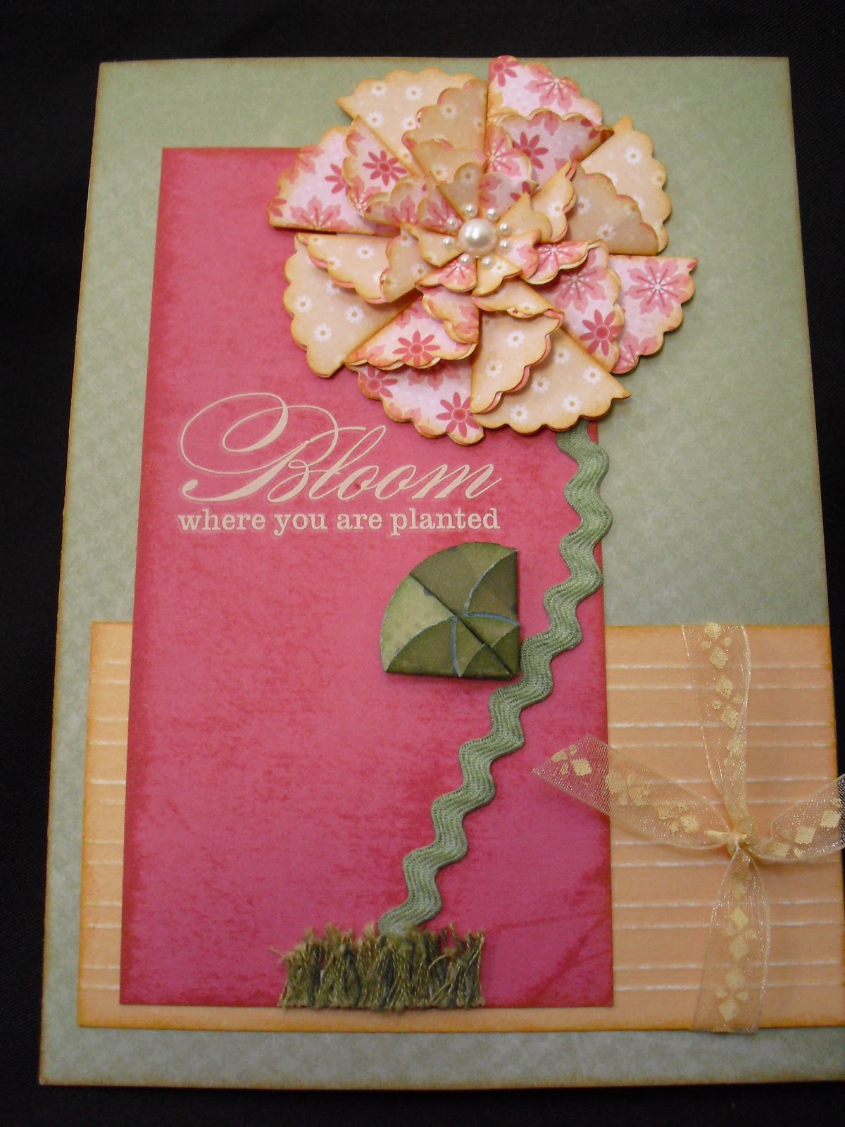
Bloom Card

This is one card I made and submitted for teaching.  One that makes highlights our wonderful products.  I'm not talking about stamps here.  In fact, no stamp touched this card.  I utilized our two punches -- the 1 1/4" circle and 2" scallop circle.  If you look closely you'll see that the grass is embroidery floss.  The stem is sponged colonial white ribbon.  There are opaque pearls in the middle of the flower.  I love it!!


The pattern for this was from a friend.  The closest "relative" would be a modification of Side Focus from Originals.  My card measures 5" x 7" finished.  The background paper for the flower is from Sophie paper packet.  The green background and leaves come from the Lucky Paper packet. 

The Hollyhock cardstock has been distressed directly with ink (gently sweeping the ink pad on the paper), and score lines have been added to the Creme Brulee paper and subsequently sanded.  The saying?  That's a rub-on.  And finally, the ribbon was added to complete the look (which I just realized -- making the product list -- is discontinued -- I am so sorry).  I would use the crotched ribbon from the Colonial White collection if I did this card again knowing I couldn't use the ribbon I did.  And I would sponge it with Creme Brulee ink.

I've been lucky enough to purchase many of the individual items for this card over time.  One thing I'd like for you to take away from this card is mixing and matching paper packets.  Okay, another thing is the beauty of our background and texture paper (did I mention versatile too?).

All Products CTMH:
X7137B Lucky Level 2 Paper Packet
X7131B Sophie Level 2 Paper Packet
X5754   Creme Brulee Cardstock
Z2123    Goldrush Ink Pad (for sponging flower petals, Brulee and Olive paper)
Z2128    Hollyhock Ink Pad
Z2137    Olive Ink Pad (sponged onto the ribbon for the stem)
Z1126    Colonial White Ribbon Collection
Z1094    Green Assortment Embroidery Floss (Olive mostly and a  little New England Ivy)
Z1336    Pearl Opaques Adhesive Gems
Z1265    Primavera Rub-Ons
Z1392    2" Scallop Circle Punch (flower petals)
Z1311    1 1/4" Circle Punch (leaves)
Z1151    3-D Foam Tape (under top of leaves to give dimension)
Z1204    Bone Folder (for score lines and crisp folds for the petals and leaves)
Z1294    Sanding Kit (for scored lines)

Monday, February 28, 2011

My Creations (R) Cubes

Recording this video was the last thing I needed to do to complete my convention teacher submission.  Keep in mind I'm an amateur and my up-line Bren was behind the camera.

I really enjoyed creating each side of the cubes.  I say in the video that there are four sides.  Of course there are 6 sides to a cube.  I only decorated 4 of the sides so that the cubes would lay flat on the surface.

Over the next several days (and probably weeks), I'll go into further depth of what I did for each word in terms of techniques and accessories.

Okay, on with the show.


Oh, I have to tell you a funny story about filming. The camera we used is my daughter's so neither of us knew how to use it well. Bren started behind a couch and the idea was to zoom in. After the first cut and viewing of the take, it was obvious the microphone was too far from me. Bren came in front of the couch. And then she says, "Oh, this will be better. If I just sit on the back of the couch..." As she's sitting down on the back, I want to say, "be careful..." But the words never got a chance to leave my lips. Bren had already fallen over the back of the couch! Needless to say, Bren didn't sit during the filming. :)