Showing posts with label technique. Show all posts

Thursday, January 24, 2019

January 2019 Slide Up Cardaholics' Card

Today I'd like to share with you my card for my Cardaholics exchange.  It's called a pop up card, but I think it should be called a slide up card.
I made them with fun colors, although two families, because I couldn't decide which I liked better.  The front two cards are in the envelope ready position.  Then the middle part slides upward to create a self standing card.  Thus "slide" rather than "pop".  : )

The base of the card measures 4.25" x 11".  You're going to score along the 11" side at 1", 2.75", 3.75", 5.5", 7.25", 8.25", and 10".  The focal consists of several layers:
  Cardstock layer: 2.75" x 5.5" - here it's Canary and Lemon
  Focal mat layer: 2.5" x 5.25" (there's another one this size on the back for you to write a greeting and is cardstock) - here it's B&T and white cardstock (on the back)
  Focal layer: 2.25" x 5" - here it's Sweet Leaf and Lilac

The front "celebrate" was stamped on B&T paper that measures 0.75" x 4"

On the 5.5" score line, you are going to want to cut out a slit from about 0.75" to 3.5" on either side of the score line.  That's creating the space needed to have the focal slide through so it can stand.

Willow Card:
Item # Description
X6026 Willow cardstock
X6008 Lemon cardstock
X7240B Something Fierce Paper Collection
Z2807 Willow Ink
Z2812 Raspberry Ink - second generation
Z6502 Peach Ink - base of icing
Z6508 Bluebird Ink - cupcake wrapper and candle
Z2808 Lemon Ink - flame
Z1979 Journaling Pen - around "celebrate"
Z3189 White & Gold Ribbon
D1827 Years of Sweetness stamp set
retired Confetti Embossing Folder
retired various ribbon

Thistle Card:
Item # Description
X6024 Thistle cardstock
X5998 Canary cardstock
X7242B I Heart Us Paper Collection
Z2840 Thistle Ink
Z2812 Raspberry Ink - second generation
Z6502 Peach Ink - base of icing
Z2895 Lagoon Ink - cupcake wrapper and candle
Z2808 Lemon Ink - flame
Z2805 Black Ink
D1827 Years of Sweetness stamp set
retired Confetti Embossing Folder
retired various ribbon

Friday, June 29, 2018

Eclipse Birthday Card

I've see these cards on Pinterest and Facebook.  Well, I finally made time to make one!  This was for my Cardaholics group with the challenge of a birthday card.  I was inspired by the colors of Central Park paper packet.
I used our Thin Cuts - Block Alphabet (Z3386) for this.  I thought about using the Cricut, but decided it would be more accurate making them the "slower" way.  Even though it might sound like it took a long time, it wasn't really that bad.  Let me explain how I made my card...

The scene is on 3.5" x 4.75" and is backed by Pacifica cardstock (X5968) that measures 3.75" x 5".  First, create 2 masks of the balloon.  The balloon came from the stamp set accompanying the Art Philosophy Cricut Collection, but any balloon will do.  Why create two?  Well, because you'll want to cover two balloons at once to create the pattern.

I stamped all of the Glacier (Z2841) balloons first.  The I masked those (one at a time) to stamped the Poppy (Z2852) balloons.  I stamped one on scrap White Daisy cardstock too.  Then, I masked both of those colored balloons to stamp the Willow (Z2807) ones.  Looking at the "W" is a great example why you need two masks.  Finally, I stamped the Lemon (Z2808) balloons.  I tried not overlapping that one but did to go between the two Willow balloons (again 2 masks).

Next, I added the balloon strings.  I had to put the mask back on a few times.  And I added a string to my scrap balloon.

My Cuttlebug came out after the last step.  I laid "WISH" out and when I was happy, I added painters tape to the letters with overlapping tape.  NOTE: you'll want to have clearance on the top and the bottom of the Thin Cuts to poke the letters out.  If your painter's tape is wide, cut it down.  I didn't want them to separate and have to build the word each time.  I've since learned that  if you have Cling Wrap plastic wrap - the one that's sticky on one side - that could be used instead of the painter's tape.  It's probably better too, since you can see through it.

Position the "WISH" onto the stamped paper securing it in place with the overlapping tape.  Run through the machine and poke out your letters.  NOTE: if you are making more than one of these cards, make sure your word stays with it's matching background!

Once the letters are cut, they're ready to have 3D foam tape (Z1151) added to the back.  I used the regular height for this (and the balloon).  The stamped part was adhered to the Pacifica cardstock which, in turn, was adhered to a card base.  Then "A BIRTHDAY" was stamped so it could be lined up with the edge of the "W" in Pacifica (Z2892) ink.  The letters were put back in their respective hole.  The balloon received the thin 3D foam dots (Z3341)on the balloon, but the end of the balloon was adhered to the card using Bonding Memory Glue (Z553).  The final step was adding the Central Park Sequins (Z4178).

Done!  My take of the Eclipse card.  : )

Thursday, February 15, 2018

Sunny Thoughts Envelope Bag

A fellow consultant challenged me the other day to make something from a box of Kraft colored envelopes.  While we were talking about potential projects, she teasingly asked if I remembered making bags out of envelopes.  She gave me a box of the envelopes, "downsizing" she said.  ;)

I do remember the days we created a bag from an envelope and set out to do just that again.


Let me walk you through how I created mine:

Seal the envelope. That's simple enough.  The flap will allow the bag to be closed rather than drafty.

Cut the envelope - usually in half, to create an opening for the bag.  These envelopes are 11" long by 4.75" wide, and I didn't want my bag that tall.  I cut the envelope in half anyway.  Then I cut an additional 0.25" (from the cut side), twice, for my handles.  And then I just cut off some more so that a gift card would just sit inside the bag.  Therefore, before scoring, I cut the envelope to 4.25".

Score the bottom and the sides.  The first one I scored at 0.75" on the bottom and 0.75" along each side.  I decided it was too wide for me, so I scored this one at 0.5" on the bottom and 0.75" along each side.
Fold on the score lines, really well, folding in the both directions.  Your bone folder really helps here.

Create the bottom.  Now that you've folded the score line really well, open up the envelope.  You will have the natural envelope edge in the middle of your two scored lines.  And as you square the bottom off, you'll notice you have a triangular section forming below the bag.  That's good!  Those triangular sections will get folded and glued to the bottom of the bag.  Use a bone folder to get into the corners of the bag.
You'll also notice the sides of the bag forming too.  Those are created from the scored lines along the side.  Go ahead and define the sides more too.

Decorate!  I thought the color of the Kraft matched our Gimme Some Sugar paper (X7228B) really well, so I went with that.  : )
The "You are the Sunshine in my pocket" stamp is one stamp, so I stamped it once on a 2.5" circle (thin cut Basic Circles - Z3318) in Peacock ink (Z2849), cleaned it, and stamped it again on scratch White Daisy using Tangerine ink (Z2809).  I used a paper trimmer to cut just below and above the dotted lines (highlighting "SUNSHINE"), bannered the edges, inked the edges with Tangerine, and mounted it with Thin 3D Foam (Z2060).  I also inked the edge of my circle with Peacock ink.
For the single flower (that's a single stamp too),  I stamped it once in Tangerine ink, and created a second generation with Juniper ink (Z2865).  Have I ever mentioned that I'm anal?!  I cut around the Tangerine flower, and when I cut the Juniper image, I cut off the ends of the flower.  Most of the Juniper flower is still there, for placement and anchor, of the Tangerine flower that I glued directly onto the Juniper flower.
For the handles, I cut them shorter, removing the envelope flap.  I used the bone folder to create the curve of the handles.  That's achieved the same way you curl curling ribbon with scissors.  The bone folder doesn't damage the paper though.  : o  Bonding memories was applied to the ends of the ribbon to adhere them to the bag.

Fill it!  Put a small surprise in your bag, and watch the recipients face light up when they receive the bag!  : )

Sunny Thoughts (S1802) has additional good stamp images.  It's only available through the end of the month.  Don't wait, we're halfway through February already!!

Thursday, February 1, 2018

Butterfly Mobile

Do you, or someone you know, have a young girl?  If so, maybe the Butterfly Mobile bundle is right for you.

Have a girl or boy who likes other colors?  Use the instructions to create any color butterflies flowers, creating your own mobile!

Heck, cut any shape you'd like out for other types of mobiles!  Oh, no, my brain is starting to cramp with all the possibilities!

Close to my Heart has made ordering this project a breeze by bundling it together - and at a discount.  All the supplies (except adhesive) to create this project is 30% off.  There's a bundle with the stamp set too.

Here's the video on how to assemble the mobile.  : )


Need more help putting it together?  I'm here to help.

I'm full of questions today, aren't I?!


Tuesday, August 15, 2017

Cardaholics Creative Block Inspirational Blocks

What do you do when you have a creative block?  You roll the dice!  Inspired by a magazine, I made up some inspiration blocks - each block representing something dealing with creating a card or layout; Color, Embellishment, Technique, and Theme.

Each block was made from the Artiste Cricut Collection (retired) page 45, 3D Object.  The finished block is 1.5" x 1.5" x 1.5".  Each block is covered with a different Fundamental B&T family.  I'll admit, I was short on time, and printed the items instead of stamping them.

On the COLOR block, the choices are: Black and White, Reds and Yellows, Blues, Primaries, Secondaries, and Tertiaries.

On the EMBELLISHMENT block, the choices are: Brad/Gem, Flower, Button/Sew, Ribbon/Twine, Glitter, and Distressing.

On the TECHNIQUE block, you'll find: Pattern/Pinterest, Monochromatic, Watercolor, Embossing, Fancy Folds, and Coloring.

And on the THEME block: Floral, Animal, Thank You, Blank, Birthday, and Beach.


The 3.5" x 6" bag topper was fun to make.  The word "CREATIVE" was stamped in Nutmeg (Z2830) ink using Jennifer's Hand (B1484) stamp set.  "BUSTER" was then stamped in Toffee (Z2828) ink.

"BLOCK" was created with the Marker Alphabet (E1034) and Bashful (Z2819), Blossom (Z2810), and Raspberry (Z2812) inks.  The entire word was inked in Bashful.  Then 2/3s of the word was inked in Blossom (leaving the very bottom as Bashful).  The top 1/3 of the word was then inked in Raspberry (the darkest red).  Then the image was stamped on the White Daisy topper.  Note: If you make more than one, you'll need to clean the stamp before going back to the lightest color.

A small bead of Liquid Glass (Z679) was used to adhere the bag to the inside back of the topper.  Another bead was used to keep the Enchantment Sapphire Twine (retired) in place at the fold of the topper.  Hook and Loop Dots keep front side of the topper down.  One hook dot is adhered to the bag while the loop dot is on the inside of the topper.

So, when I can't think of something to make, I whip out my handy blocks, roll them, and move forward with what they suggested.  No more creative block!


Tuesday, June 27, 2017

Hinged Ghirardelli Box Holder

I'm ready for convention... at least my swaps are!  I came across a hinged box by Caroline Helwigh Wright.  I was fascinated, but needed to modify her dimensions to fit my needs (getting more than one box from a 12" x 12" cardstock and fitting something yummy inside).  : )

The most important aspect of this hinged box is that it needs to be square.  If it's not square, it won't close!  Each box measures 5 ¾” x 6 ½” and is cut from cardstock.  You'll be able to make 2 boxes from one 12" x 12" sheet of cardstock.

Along the 5 ¾” side, score at ¾”, 2 7/8", and 5".
Along the 6 ½” side, score at ¾”, 2 7/8", 3 5/8", and 5 ¾”.

Cut along the solid blue lines shown in the picture.  Not shown are the tabs wedged to make it easier to fold (but take a look at the pictures below for how I wedged mine).
Chocolate  hinged box holder

After I cut on the lines, I stamped the outside front flap/cover.  I thought it would look cool not to stamp the sides, but it took a little more time to avoid the sides (I masked the sides with paper).  Once the stamping was done, I put Scoretape on the appropriate places (see picture).

chocolate holder dimensional box


To make it super simple, I didn't layer on the outside of the box.  I chose to cut some images out from Artbooking Cricut Collection.  And since I get bored quickly (once I figure things out), I made two different designs.

The first is Hugs found on page 49 under the <icon> and <icon><shift> (2nd column, 2nd row).  Both the heart (in Thistle Cardstock) and "hugs" (in Pansy Cardstock) are 1.82" x 1.82".

I stamped in Cashmere ink on Cashmere cardstock.  The stamp is from the Flower Market Collection.


chocolate holder dimensional box
The second of my swaps are "just BE" cut from Emerald cardstock (found on page 39 - <title><shift> (2nd column, 1st row) and be yourself - at least the banner part - found on page 41 <title> (4th column, 1st row).  Using Design Space, I hid the "be yourself" with the hide contour feature.  Then I made the banner 1.8" wide and 0.35" high.  Originally I was going to keep "yourself", but it didn't look right; and I realized I would have to back the banner with another piece of paper, so I took the word out.  After the banners were cut from Willow cardstock, I stamped "YOU!" with the Pen Pals Alphabet stamp set in Black Ink.

This time I stamped in Bamboo ink on Bamboo cardstock.  I stamped on the wrong piece (the inside) so I had to go back and restamp!  Again, I used paper to mask the ends.

chocolate holder dimensional box


The green dot in the cutting diagram (above) is an optional, although highly recommended, hole for the pull string.  To make the pull string, I used the White Twine, Willow ink and Thistle ink (corresponding to the box in mind) and a sponge dauber to color the white twine.  Hold the end of the twine and pull the twine between the dauber and the ink pad.  Pull the twine several times to get the intensity of color you want.  I fed about a 2" piece of the pull string through the hole, securing it to the inside with regular tape.


The front flap/cover measures about 2".  If you'd like to add a mat or decorate the flap/cover, you'll want your papers to be smaller.

Want to get the dimensions of "HUGS" and "just BE YOU!" just right?  Let me make this simple... Here is the Design Space canvas file: https://us.cricut.com/design/#/canvas/62185737

Ready for the finished products?!

chocolate holder dimensional box


The hinge is on the bottom left.  The easiest way to open the box is to hold the upper left corner with your left hand while pulling the twine with your right.  Then the treats are revealed, removed, and consumed.


Cute, right?!  Now it's your turn!

Item Number Name
Z2805 Black Ink
Z2803 Bamboo Ink
Z2875 Cashmere Ink
Z2840 Thistle Ink
Z2807 Willow Ink
X5932 Cashmere Cardstock
X5782 Pansy Cardstock
X5769 Thistle Cardstock
1301 Bamboo Cardstock
X5783 Emerald Cardstock
X5784 Willow Cardstock
Z3285 or Z3290 Flower Market Cricut Collection - background stamp sets
Z3169 Artbooking Cricut Collection
B1539 Pen Pal Alphabet stamp set
Z3216 White Twine
Z726 or Z1938 Sponge Daubers
Z1204 Bone Folder - to score and burnish
1512 or Z553 Bonding Memories Glue - to glue the Cut pieces together and to the box
Z1151 3-D Foam Tape (to mount the banner)
Z534 or 1836 Micro-tip Scissors
Scoring board
Score Tape / Red Line tape

Sunday, August 28, 2016

Flower Market Friends Banner Card


I received this card from a friend (and consultant) of mine, and fell in love with it.  She made it with the new Flower Market Cricut Collection.  As you look at the details, notice the texture of the flower and leaves.  Those are two stamps from the three stamp sets that come with the collection.


So, I had to lift Candace's card and knew the perfect card to use it for.  My Cardaholic's challenge was to use summer colors - vivid yellow, orange, pink, and green.  I was going to a adopt Candace's card.


This is what mine turned into.  I used Design Space to create it.  Using Design Space allowed me to create the card base as well as the petals and leaves fill in.  Let me explain...

CARD BASE (my picture cut off the bottom - look at the below image to see the points of the card): After importing the image, I copied and pasted it.  I will use the second copy for the "detailed" work. To the first copy, I ungrouped the images and then deleted the top part, leaving the solid banner.  I then sized the banner to my desired size (I kept the size linked/locked) - about 4" x 5.5" - I wanted the card to be able to fit into a standard envelope.  Now that was done, I copied the image, rotated it 180 degrees, butted the straight sides together and welded the two images.  Once that was done, I added a score line at the seam.

DETAIL: Next, I sized the detail to match the card base.  Easy peasy. I made another two copies of this and pasted them.

FLOWER: With one of the copies, I ungrouped the pieces and deleted the solid banner.  I then went into "Hide contour" and hid everything but the five petals.  I then enlarged the petals so that I could glue them to the underside of the flower.  It's hard to tell, but I embossed the leaves with clear embossing powder.  I used the same stamp set Candace did.  Then I used Bonding Memory Glue on the Whisper cardstock flower outline and adhered the petals.  Canary was the color of choice.

LEAVES: The second (really my third) copy of the banner was used for the leaves.  I repeated the FLOWER process for the leaves.  This time I stamped tone on tone (Pear ink on Pear paper).

FRIENDS: This was cut out with Whisper cardstock.

By using the Hide Contour feature, I didn't have to cut the whole top part out in the different colors.  Therefore I had very little waste of paper.  : )

The card was finished off with some bakers twine threaded through a bling button.

Here are the cards side by side...
You can see what a difference colors can make.  : )

To note: Candace uses an Expressions machine and doesn't use Design Space. Design Space isn't needed, but it's nice if I need to make this card in the future, I can just access the file.  You'd be able to replicate this in Craft Room too (for Expressions machines).  Design Space is for Explore or Air machines.  If you haven't purchased a machine yet, I suggest the Explore or Air.  Although the prices of the Expressions have dropped, they are being phased out.  You'll need to start using Craft Room as more cartridges go digital.  Design Space is a much more powerful program.  The disadvantage to the Explore/Air is that the machine is not a stand alone - you need a computer to cut your images.  Using the Craft Room will require your machine be connected to the computer though.

Sunday, July 24, 2016

Color My Heart Color Dare and CAS(E) This Sketch


This week's Color My Heart Color Dare #203 is all about Canary, Sorbet, Crystal Blue, and White Daisy.  These colors are from the Zoe paper packet.  Instead of capitalizing on the paper packet, I thought I'd show you how you can use cardstock and still have a wonderful card.


When I saw the CAS(E) sketch for last week, I knew it was a match made in heaven.  The simplicity brings out the colors of the Color My Heart Color Dare.  : )
First off, here is the sketch for last week  and the Color Dare Colors.


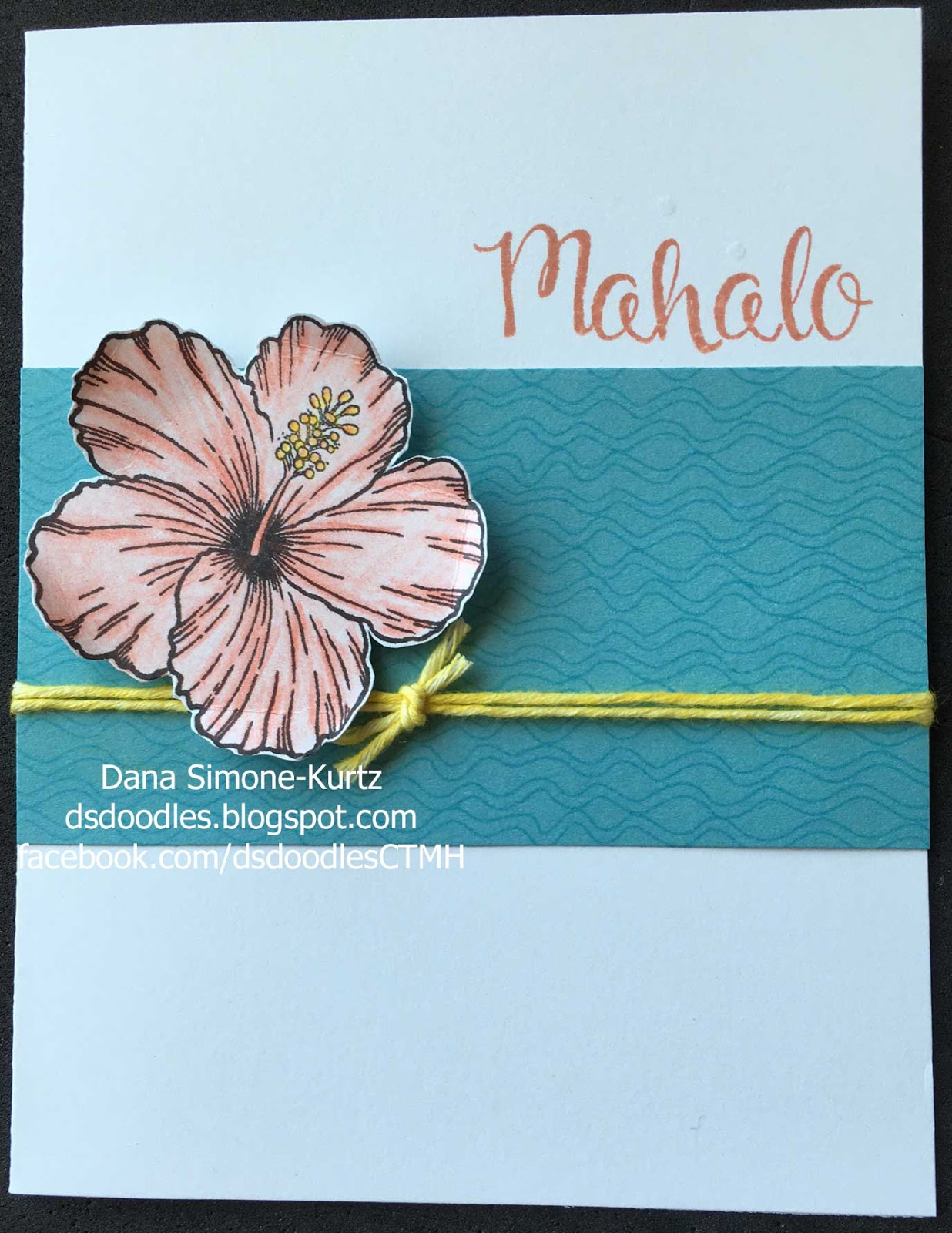
Take a look at the Crystal Blue cardstock.  It isn't a solid color!  That's because I went and used Crystal Blue ink with the wavy lines (I was thinking Hawaii's ocean) from Jumping Geometrics stamp set.  Tone on tone stamping makes for subtle but pleasing patterns while not being too bold.

I colored the flower in with CTMH Watercolor pencils - sorbet - using several layers and pressure to make the flower look more dimensional but staying with one color.  The stamen is colored with Sunny Yellow under Sunflower to give the color Canary. I could have gone back with water to soften the color of the flower but decided against that look.  Maybe I'll have do it anyway so you can see the difference...

Since we don't carry Canary Twine, I took our White Twine and colored it with Canary ink!  How is that done?  Simply hold the end of the twine with one finger.  Dab a sponge dauber (or sponge) in your color choice (here, it's Canary), and sponge the twine.  Want to go faster?  Position the twine so that it's sandwiched between the ink pad and sponge dauber.  Pull the twine through.  Repeat until you get the coverage you desire.  The knot was created the same way and then tied on around the two parallel twine pieces.  I was able to slide the knot to the desired place (it took a few tries to make me happy).

After cutting out the flower, I mounted it with 3D foam tape.  The saying (and flower) are from the Hawaiian Hibiscus set, and is stamped with Sorbet ink.

I hope this has inspired you!

All CTMH Supplies:
D1637 Jumping Geometrics (available through July 31, 2016)
B1527 Hawaiian Hibiscus (available through Aug 31, 2016)
Z2117 Crystal Blue Ink
Z2164 Sorbet Ink
Z2643 Canary Ink
Z2105 Black Ink
1292  Crystal Blue cardstock
1385  White Daisy carstock - scrap for flower
X254 White Cards and Envelope Value Pack
3505 Watercolor Pencils - Sorbet, Sunny Yellow, and Sunflower
Z726  Sponge Dauber
Z3216 Twine - White
Z1151 3-D Foam Tape


Monday, April 25, 2016

April 2016 Stamp of the Month Sample

Before the end of the month happens, let me share my Stamp of the Month card.  I made this card when I was working on the Color Dare #187 (greens and white).


This stamp is another good one to have.  As you can see, it's got lots of different types of cameras.  Buying this stamp set now is a good thing.  A purchase like this one reminds me of Costco.  You have to buy the item while you are there because it probably won't be there the next time you go.

This stamp set will only be available until the end of April (as will all stamp sets in the Seasonal Expressions 1 booklet), so don't wait too long to shop!


And now for the card...

I made this card when I was working with the greens for a Color Dare challenge.  The card base is Topiary cardstock.  The background swirls are from Love Life (D1482 - available through July 31) stamped in Sweet Leaf ink (Z2153).

The frame for "Smile!" is from the set Crafted with Love (B1399 - available through July 31) in Topiary ink (Z2155), while the word is stamped in Black ink.

The black glitter underneath is Black Shimmer Trim (Z1809).  I took my Scallop Punch (Z1851) to the trim (that's because I didn't have Glitter Paper when I made this).

The other neat thing about this card are the sequins.  I took our Black ShinHam Marker (Z2446) to the Silver Sequin Assortment (Z2013) and colored the sequins!  Don't be afraid to try that.  : )

Saturday, February 27, 2016

Easter Box from Artiste Cricut Collection

How about this adorable Easter box?  Would you like to make this for your kids, friends, coworkers, and neighbors?  It's simple... let me show you how I did it.

 Like the title says, this comes from the Artiste Cricut Collection.  It can be found on page 73 of the book (the "Spring" key).

This guy is 9.5" high.  I cut it out with White Daisy for the bunny to be white.

The pink, purple, and green tape you see is from the Limeade Washi Pack (Z3198).  That is a three pack with 1/4" Thistle, 1/4" Pixie, and 1" Pear striped pattern.

The Pear polka dots are from February's Stamp of the Month (believe it or not).  And the "Happy Easter" is from the Artistry Cricut Collection (that one has lots of words), and is stamped in Canary ink.


After my Cricut cut out the piece (it's one piece), I folded along the score marks.  The Thistle washi tape was placed just under the scored part of the side (see above picture).  Under the Thistle, I added the Pixie washi tape, butting them next to each other.  I then folded the sides of the box and trimmed the excess washi tape.  I repeated the process for the other side.

Next, I folded the curved flaps up and placed a post-it note across the flap to mark where the Pixie washi tape hit.  I kept the note there while I stamped the dots in Pear (the dots would show up under the washi tape if I hadn't masked the area with the post-it note).  After I removed the post-it note, I had a line for where I could add the Pixie (and subsequently Thistle) tape.  The two colors wrap around the whole box. Repeat for the other side.


The Pear washi tape started where the Thistle washi tape ended, but I applied it perpendicular to the Thistle tape (it will make sense if you look at the direction of the stripes).  There is a slit in the flap for the bunny to fit, and I chose the size of the box so that there would be 1" on either side of the slit.  That way I didn't mess with another strip of washi tape.  (This isn't to say you can't make the bunny larger and just line up more tape.  I just didn't want to do it.)

Being me, I lined up the stripes of the washi tape when I layed the second side of tape.  The last part to finish the flaps was to turn over the flap and cut off the excess washi tape.


Last thing I did was add a Pixie nose to the bunny by inking up the same dot stamp.  Most of the stamp is off the bunny.  I had added an eye with the same method but it was out of proportion so didn't do it again.

That's it!!  Fill the box with little goodies (chocolate is a favorite) and then nudge the bunny through the slits.

For this, I put the nose and ears through first (the tail wants to take cuts).  I found this the easiest (and less frustrating) way to do it.


I hope your try making one today!

Saturday, January 30, 2016

Not too late for January's Stamp of the Month

It's still January, so you can still purchase the January Stamp of the Month.  If you weren't convinced before, see if this example doesn't put you over the top...


I used the baby's breath within the stamp set (at least that's what I see it as) and "love you!"with this simple card.
January Stamp of the Month set


Let me walk you through how I made this...

First of all, the card was inspired from a pinterest post, which in turn came from another pinterest post (no website listed).

I cut a 2" x 4.25" piece of White Daisy cardstock.  Using VersaMark ink(Z891), stamp the baby's breath twice (I went with different heights), pour White Embossing Powder (Z2068) on the images (tap off excess), and heat (Craft Heater Z555) the powder.


Next, I started with Cranberry Ink(Z2116)(the darker red color) and Sponge Daubers(Z726)*.  Moving in a circular pattern, rub on the Cranberry ink around the sprigs and in the corner - wherever you want it, really.  Definitely don't go straight from your ink to the project, though.  You'll end up with some very dark spots.  Repeat with Pomegranate ink(Z2653) (purplish hue) and then Poppy ink (Z2652) (bright spots) (I used this one sparingly).  Note that there are sections that don't have any ink.  *When I do this again, I'll use our Sponge (Z697)instead of the Daubers.  The Sponge is much stronger for this type of job (applying in a circular motion).  The tops of my used Daubers crumbled off.

The last step before assembling, is to stamp the breath.  I stamped first generation with Cranberry ink.  I cleaned the stamp, and added second generation (stamp off on scratch paper first) breath in Pomegranate ink.  You can see I stamped at different heights to give it more depth (that's what the second generation stamping does too).

Adhere the strip to the card front, and stamp a saying below (Cranberry ink for this card), and whalaa, your card is done!

I'm thinking this will be my Valentine's card to my husband.  It says "I love you" without being too lovey dovey.  Although, he's seen this card, so I might have to come up with another one.  Too bad!

Right... I got carried away with telling you how to make this card that I almost forgot to remind you that you have until Sunday at 11pm Pacific Time to order this set.  This set would allow you to make a great Anniversary card too!

Saturday, January 9, 2016

Cricut Cupcake Pullout Cards

I had some fun with these cards I made for my some of my nieces and nephews.
These came together relatively quickly, and looked in person how I envisioned them (always an added bonus).  : )

The cupcake is from the Artiste Cricut Collection.  In Design Space, the three parts (cupcake wrapper, icing, and back) come as one image.  Before I ungrouped them, I sized the image to be 5.25" in height (I may have unlocked it the height and width and made the width 4.25").  I wanted it to take the entire A2-sized envelope.  You can change the size to whatever your needs are.

After ungrouping the three images, I copied and pasted the back.  Then I shrank the copied back a little (I eyeballed this) so that it would fit nicely inside the cupcake wrapper.

I cut the images out - the back in Bamboo, and wrapper with Zoe paper collection, and the icing in Canary.  Done with the Cricut machine.

Next I went to my Cuttlebug.  I used the Chevron embossing folder on the wrappers.  Oh, if you look closely at the picture, you'll see the cupcakes are mirror images of each other.  The wrappers are both sides of the same paper, so I reversed the icing and the backs.  This is important for the sprinkles on the icing.  When you run your icing through the Cuttlebug, you want them in the correct orientation so the sprinkles are going outward instead of inward.  With the correct orientation of the icing, I used the Confetti with the Circle Diffuser (so I'd have a flat space for the saying).  I chose the Confetti embossing folder over the Dot folder because I wanted the sprinkles to be more random.  Done with the Cuttlebug.

Next, I sanded the embossed bumps of the icing with the Sanding Kit.  You can see I left some of them white while I colored the rest.  I colored sprinkles with Leaf Green, Tender Pink, Golden Yellow, Turquoise Blue, and Lavender.  I stamped various "Happy Birthday"s from the Joyful Birthday set (B1419) in either Sorbet or Glacier, whichever corresponded with the wrapper color.

Assmbly: I added scor-tape (1/8") along the outside of the larger back.  I adhered the wrapper to that strip to create a pocket.  Then I slid the smaller back into the pocket, after adding some scor-tape to where the icing will go.  I aligned the Canary icing to the card and then adhered it to the smaller back.

Last thing to do is to write something on the pull out and there you go!  You could add a gift card or cash to the backside of the pull out if you'd like for an extra treat.

Saturday, December 12, 2015

6th Grade Camp Card 4 of 5

Today's camp card was inspired by the color Pacifica.  It is one of the colors from the Kaleidoscope paper packet, but I wasn't happy with what I had in my mind with any of the background and texture papers.  Finding the Words ( D1646) was the only stamp set used for this card.

Bandwidth is the pattern, came from Originals, and is on page 31.

The Pacifica cardstock background was distressed by lightly rubbing (in a circular motion) the Pacifica ink pad on the cardstock.  In fact, all of the distressing was done with Pacifica ink.  The Lagoon band with "Love" and the two squares (Sweet Leaf and White Daisy)  are sponge distressed.

The hearts were stamped in the three colors of the card - Sweet Leaf, Lagoon, and Pacifica.  They are placed on the card to stand out.  It wouldn't have looked as good if I put the Pacifica heart on top because it wouldn't stand out as much, just like the Lagoon heart wouldn't being on top of the Lagoon  band.

Sunday, November 8, 2015

One More Fallen Leaves Example

By changing the colors, your card can look very different, even when the same stamp set is being used.  Take this card as an example.  The Poppy ink and background color takes on a truer fall feeling than this card as Fern is the focal, and even this card with Saffron accents.


The rolling technique was used with Saffron and Poppy ink.  Ink the leaf with Saffron ink, then roll the stamp's edges in Poppy ink, inking just the outside of the image.  Then stamp the image on the paper.  Make sure you stamp off the image before returning it to Saffron for another image so that the Poppy doesn't "stain" your Saffron ink pad.

Don't worry if it does, just grab a tissue and wipe the Poppy ink off of the Saffron inkpad.


Sapphire and Fern ink round out the colors used for this card.  The saying is highlighted by mounting it with 3D Foam Tape and the Gold Sequins.


I could continue making these cards in different color combinations, but I have other projects to get to.  Hopefully you see the versatility of your stamp sets, and that you can use them over and over - never getting bored by making the "same" thing again and again.  : )

Monday, October 26, 2015

More Fallen Leaves Stamp Set Cards (Eggplant)

Now that Halloween is practically behind us, I thought I'd share another fall card featuring the Fallen Leaves stamp set (B1492).

 The colors here are Fern, Eggplant, and Sapphire.  The leaves are randomly stamped on the White Daisy cardstock and matted with Black cardstock.  Fern ink was used for the saying which was raised with Thin 3D Foam as the focal point.

Interest was added with the addition of the Enamel & Glitter Duos (Z3122 - 3 shades of blue) and the Woodgrain Embossing Folder (Z1996) with the Eggplant cardstock as the base of the card.

When stamping multiply images, you'll want to stamp with the largest image first.  Here it's the Eggplant Maple leaf.  Next comes the smaller sized leaf.  In this case it's the Sapphire elm(?) leaf.  Finally, work with the smallest stamp and fill in the gaps.  I didn't worry about overlapping the images - even if they were solid stamps - because it adds interest to the card.

I did sponge the edges of the base of card with Eggplant ink.

The saying comes from the Artistry Cricut Collection.  There are three D-sized stamp sets in collection, so don't forget to use them (with or without cutting it out on the Cricut first).  : )

Monday, October 19, 2015

A Closer Look at Watercolor Pencil and Watercolor Paint

I forgot to share with you a close up picture of the watercolor paint and pencil.  So here you go...
I also want to call to your attention that there are times were markers DON'T work.  This is one example!  The embossed lines do not allow the colors to blend well - or at all!  The leaf looked pitiful in real life too.

But on the brighter note, you can see that the watercolor pencils don't look that good before adding water.  The problem with the pencil was the same as the markers.  The embossed lines didn't allow the best to come out with the tool (pencil and marker).  However, you can see what a difference the water makes with the watercolor pencils.  If you felt the colors are too dark with the watered pencils, you could add more water to lighten the look.

Markers are a much better when used in open areas of coloring.  If I hadn't embossed the leaf, the marker would be a viable tool.

Look back at the cards the leaves were used in.  Here is the watercolor paint and here is the watercolor pencils.

Sunday, October 18, 2015

Watercolor Pencils with Fallen Leaves

Want to see the difference between the watercolor paint and watercolor pencils?  I wanted to see the difference with my latest card -- I talked about it the other day.

Here is the watercolor pencil version of the Three is a Charm (modified from Originals) card...
After I embossed the leaves with Gold embossing powder, I took my watercolor pencils and colored the leaves.  Purples and Greens for the one on the left.  Yellows, Oranges, and a little Red for the middle leaf.  And Purples and Pinks for the leaf on the right.  Then I took a paint brush with a little water on it, and blended the pencil marks together!

Did you go look at the other card yet?  Can you tell the difference between the two?  Here, look at them side by side (I'll even make the picture bigger)...
You can't really tell the difference, can you?  I even had a hard time telling them apart!  The back card is the watercolor PENCIL card.

So why am I showing you this?  Because you may want to give those pencils another try.  The thing I like about the pencils is that I put the color exactly where I want it.  If I want more color, I layer the pencil more.  Then I blend it with water, and I get beautiful colors.

However, the watercolor PAINT colors can be more natural because there is more color variation as the brush dries and I'm applying the color.

Will I give up one for the other?  NO WAY!  Both methods have their advantage.  For this card, I love the look either way!


Tuesday, August 4, 2015

August 2015 SOTM Inspired Card

I really like the white on white motif of the August 2015 Stamp of the Month shown here.  So much, I wanted to create a similar look.


Inspirational card!

I had also just gotten my new Artistry Cricut Collection and NEEDED to try that out.  The resulting card is here to the right.

There are three layers to this card.  A Fern layer (replaced Olive and are the leaves), a Canary layer (the flowers) and the White Daisy Layer.  I stamped "THANKS" in Slate.

I created this card within Cricut Design Space (software for Explore and Air).  You can replicate the look in Cricut Craft Room.  Use this simple technique to create this card:

For either platform, decide on the size of flower bunch you want.  Copy and paste the image twice.  The first copy you are going to leave alone - that's the White Daisy layer.  To the second copy, you are going to right click on the image and choose "hide contour".  Now your image should be purple and you can see the cut lines within the image.  Go ahead and carefully click on the lines for the flowers.  If you click on any other line, just click it again and it will come back.  Next, click away from the image.  You should now have an image that has the leaves lines and the outer lines.  That's the Canary layer.  Finally, with the third copy, you are going to repeat what you did for the Canary layer, except click on all the leaves and flower lines.  As you see from my card, I left the between cuts alone (between flowers/leaves - where air would be). 

To assemble, add adhesive to the White Daisy  back (so you don't add glue to what will show) and glue the Canary layer on.  Now add glue to the backside of the Canary paper and put the Fern paper on.  All three layers match up because of the first step of copying the correct sized image.  Next, stamp the saying in the bottom right corner.  And, finally, glue the flower bunch to the card, trimming the excess pieces off.

Saturday, October 18, 2014

Bat Halloween Card

Although this is a quick Halloween card, it requires the Cricut Craft Room from ProvoCraft to create.  That and the Artbooking Cricut Collection.

The image you see as a card is a photo mat found on page 71 of the Artbooking cartridge.  The <v><shift> key to be more exact (Column 4 Row 4 key).

What I did was I welded the photo mat to a square of the same size, placing the mat under the square.  Then the whole length is cut, and I only have to fold the paper.  : )

The last thing I did was add Buttercup cardstock (now retired) to the inside of the card.  Today's choices would be Canary for a bright moon.

That's it!  Super easy, and super cute!

Sunday, March 9, 2014

"Emergency Use Only" Gift Bag Topper


I had an event this past weekend and made these survival bags to pass around.  I wanted to make sure everyone would be okay.  : )

I made 25 bags in a short period of time.  One of my recipients asked if I stamped each of the letters at a time.  I told her, "No, no no.  I'll be blogging how I put this together."  : )

I'd like to think I work smarter than harder -- even if the results don't show that.  So let me show you how...


The bags I used are from Joann's.  They are the Wilton bags, but you could use any bag.  I determined what size would look good for the bag size.  In this case, finished 4.25" x 2" which means for each topper I needed a 4.25" x 4" piece of paper.  Since I have 12" x 12" paper, I calculated that I could fit 6 toppers on one sheet of 12" x 8.5" paper.   I cut my 12" x 12" White Daisy cardstock to those dimensions.

Next, I "randomly" stamped my whole paper.  "Random" is in quotes because as I stamped, I created triangles with the image.  And I started with the largest stamp image.  Once my Cotton Candy large circles (Oodles of Doodles) were stamped over the paper, I repeated the process with the medium circle with Pear ink.  If you can't tell, my colors were inspired by the Lollydoddle paper.  Finally, I completed the random stamping with a small circle (from Hooray Bouquet) in Twilight ink.

I'm going to inject here to say that I HAD to buy and use Oodles of Doodles stamp set just because of the name!!  I'm super excited that I like the set!  : )


So now that my paper is stamped, and to cut down on time, I scored the paper where it's going to fold before I cut it.  This way I only have to score 3 lines -- one at 2" (not shown), 6", and 10" (along the 12" side).  Now it's ready to cut.  I cut along the 8.5" side at 4.25", rotated the paper and cut at 4" and 8".  Done.  I now have 6 pieces ready to be layered upon.

 I scanned these smaller pieces and filled in some gaps with the colored circle stamps.  When I cut the paper, some of the white space turned out to be too large for the smaller paper.


 The next layer was the Whisper paper.  This measures 1.5" x 3.75".  Again, I calculated how many I could get from a 12" paper.  I cut strips of 3.75" width from 12" cardstock.  I'd get 8 finished pieces from one 1.5" x 3.75" strip.  I placed the strip in my Dot Embossing Folder (z1924) and ran it through my embossing machine once.  The folder is only 7" long, so I took it out and moved it up in the folder (there is a slit at the fold - how awesome is that!!), I lined up the circles, and ran the strip through once more.  So two passes for 8 pieces -- not shabby.  Before I cut the paper to proper size, I sanded it with our Sanding Kit (z1294).

Next layer is the banner.  I took Oodles of Doodles banner for that.  When I stamped with the scribble, it was too much scribbling for my taste.  But I liked the look the banner provided.  I enlarged the banner to 1.25" and cut those out of Twilight cardstock.  The image can be found on Artiste Cricut Cartridge on the Accent 3 Shift key (<Ac3><Shft> Column 8 Row 3).  Got the banners cutting and got ready for the next step -- the words.


A Typeset (A1117) was the font I went with.  To assure my words fit, I took a cut banner and laid the letters on the banner as they'd appear after stamping.  When I came to a letter that repeated, I moved the letter after the following letter was placed down.  In essence there was a hole left.  Once I was satisfied with the placement of the

 letters, I took my block and attached my saying to the block!  It was then easy to stamp the saying on all of my banners in Twilight ink.  When that was done, I went back and filled in the missing "e" and "y".  The beauty of clear stamps and blocks!!

Finally, I sponged the banner and mounted it with foam tape.  I glued everything together and I finished my topper!  How's that for working smarter, not harder.  : )