Showing posts with label Patterns. Show all posts

Friday, June 10, 2016

Softball Thank You Cards

Recreational softball ended a few weeks ago.  Cards were needed for the team party.  Surprisingly, I had an idea of what I wanted them to look like.


Would you like to guess our team color?!  I did have to keep the softball in true color.  : )


These are 6" x 6" cards and come from Originals.  The pattern is called Side Focus and can be found on page 23.


I really like the industrial look the staples brought to this card.  The cards are for male coaches, so I thought it was a good addition.

This card is for the head coach who put the most time into coaching.  I wanted to set it off from the other two.  I did that with the Whisper cardstock replacing the Black cardstock.  I also added the simple word, "Many".  Simple changes make a statement.


Sunday, June 5, 2016

Calypso meets Color Dare and Addicted to Stamps

Try this on for size...  This card was created for Color My Heart Color Dare #196 as well as Addicted to Stamps and More!

What makes this card special (besides me making it  :) )?  This card was inspired from Make it from Your Heart volume 2 pattern #21 sample.

The background and texture paper is from our Calypso paper packet.  The bottom right (cotton candy striped) is one of the PML "cards" from the packet.  I used this instead of the white triangle outline on black B&T paper because it wouldn't look as colorful.  Each were cut 1" x 1".

Each B&T was backed with 1 1/8" piece of Black cardstock.  Opposite corners were cut with the Corner Rounder.

Oh, the saying Black cardstock was cut at 1 1/8" x 2 3/8".  The White Daisy cardstock was cut at 1" x 2 1/4".  "Birthday wishes" was stamped with Lagoon ink while the stars were stamped in Pear ink.

Honey cardstock (cut at 3 7/8" x 5 1/8") was layered on top of Black cardstock (cut at 4" x 5 1/4").  The 1" x 1" squares are placed 1/8" apart and from the edge of the Honey cardstock.  Then  everything was raised with Thin 3D Foam.  The saying was additionally raised with Thin 3D Foam.

Finally, the card was finished off with Clear Sparkles.


For Color my Heart Color Dare, the following colors - ALL and ONLY - are to be used


Our Current ChallengeThis site seems like a good place for a challenge (like I'm not challenged enough with time).  I lucked out trying it for the first time with the challenge as anything goes.  What does that mean?  It means I can do anything!  :)

How crazy is this?  Addicted to Stamps and More challenge is also #196!!  How cool!  Okay, okay, I'm easily amused.

Wednesday, May 11, 2016

Celebrate with Cake Stamp of the Month - May 2016

Before the month disappears on me (yes, I know we're not quite half way, but it was just February yesterday)!

Here is another versatile stamp set (S1605) that can be used for weddings, anniversaries, birthdays, and anything else you'd celebrate with cake (graduation season is around the corner).

Here's my card using the set, which I teamed up with the Magical Paper Packet (X7209B):


This pattern #20 is from Make it From Your Heart Volume #2.  The dark blue strip is actually Sapphire cardstock (X5775).  "Celebrate" is stamped on it in Black ink (Z2105).

Next, I stamped the candle and cake slice with the Black Pigment Ink (Z2503) on scratch White Daisy cardstock.  I added Super Fine Clear Embossing Powder (Z2088) over the images and heat embossed them.

For the stand, I inked that up with VersaMark ink (Z891) and heat embossed with Silver Embossing Powder (Z2067).


Coloring was done with the ShinHan alcohol markers:

The candle is colored with Carmine (Z2448), as is the base of the flame.  The flame is finished off with Golden Yellow (Z2452).  The stand was treated to Turquoise Blue (Z2465).  The accents were hit with Warm Grey 4 (Z2467) and then the Colorless Blending Pen (Z2469) softened the color a little more.  The cake icing was colored with Marine Blue (Z2458) and then the cake was highlighted with Warm Grey 4, softened again with the Colorless Blending Pen.

Then all three elements were cut out (I highly recommend our Micro-tip scissors - Z534 or Non-stick Micro-tip scissors (Z1836).


The finishing touches:

I added the candle to the back of the cake - only half of it is exposed because I didn't want it to disappear in the dotted background. The cake stand was adhered directly to the card base.  The Cake received some Thin 3D Foam (Z2060) and the tip of the candle got 3D Foam (Z1151) to add a little more dimension to the image.

Calypso Sequins (Z3215) - black and white -  were added as accents, and done!!

Tuesday, January 26, 2016

Decisions?!

I hate my job, sometimes!  Let me tell you why... And I should start with the fact that it's not a horrible problem to have.  Well it is when a decision needs to be made!

So, I'd been working on my birthday goodie cards and got to the Bandwidth card.  The plan was to emboss the base of the card and assemble.  First problem was deciding which side to have face up - the center of the design or the outline of the design (top left vs bottom right).  Next was the decision of the focal point.  Do I leave a little bit of border or more (top two vs bottom two).  After I couldn't decide which was better, I then thought of backing the base with Black cardstock to mimic the focal (top right and bottom left vs the other two).

So I made four of them and laid them all out.  Technically I should have made 12 more - one for each of the decisions, but I didn't have the time.

Do you see my PROBLEM?!  Having to make these types of decisions is just exhausting sometimes!  I didn't even have family members around to help with the decision.  And the WORST PART is I STILL CAN'T DECIDE!!

I did make a decision, but you'll have to make one too, if you receive this card as your goodie card.  You'll have to decide which embossed part goes upward.  All I have to say is, "Good Luck!"  : )

Monday, December 14, 2015

6th Grade Camp Card: 5 of 5

Whew!  So I decided on, cut, and assembled (oh, and wrote) all five of the camp cards in about 2 hours (okay, maybe 2.5 hours - it was a late night).

This last card is Middle Ground (page 19) of Wishes.  Words from Finding the Words and butterfly from Your Own Kind of Wonderful (D1627).
First off, I made my card to determine the colors I was going to paint my butterfly.  The background is Gypsy cardstock.  There is also Pixie ("Special" is stamped on that) and Cotton Candy (one step darker than Pixie) to back the butterfly.  The polka dot strip is the zip strip from one of the B&T papers.

Once I knew the colors of the card, I took a rectangular piece of Watercolor paper and my watercolors.  I painted horizontally across the rectangle.  Once it was dry (I assembled the card and others while I waited), I stamped with Black ink (you can use the Stazon on Archival Ink, but since I stamped after the paper was dry, I wasn't worried about bleedage (yes that is a word I just made up)).

There was too much white space after I adhered the butterfly on so I added some Black Sparkles (retired).  The butterfly may look like it's taking off the card (it is if you were holding the card), because it is.  I added thin foam to the middle of the lower wings and regular 3D foam to the top of the top wings.  I glued the bottom of the bottom wings directly to the paper.  Fun!

I should probably start on my summer camp cards now and put them aside so I can get some sleep before the girls leave!  Wait, I can't do that... I don't know what wonderful paper there is going to be in the Seasonal Expressions 2 supplemental.  Somethings are better to wait...

Saturday, December 12, 2015

6th Grade Camp Card 4 of 5

Today's camp card was inspired by the color Pacifica.  It is one of the colors from the Kaleidoscope paper packet, but I wasn't happy with what I had in my mind with any of the background and texture papers.  Finding the Words ( D1646) was the only stamp set used for this card.

Bandwidth is the pattern, came from Originals, and is on page 31.

The Pacifica cardstock background was distressed by lightly rubbing (in a circular motion) the Pacifica ink pad on the cardstock.  In fact, all of the distressing was done with Pacifica ink.  The Lagoon band with "Love" and the two squares (Sweet Leaf and White Daisy)  are sponge distressed.

The hearts were stamped in the three colors of the card - Sweet Leaf, Lagoon, and Pacifica.  They are placed on the card to stand out.  It wouldn't have looked as good if I put the Pacifica heart on top because it wouldn't stand out as much, just like the Lagoon heart wouldn't being on top of the Lagoon  band.

Friday, December 11, 2015

6th Grade Camp Card #3 of 5

I have so much to share this week, I'm doing it twice today!


This card made me smile!  The butterfly is from Your Own Kind of Wonderful (D1627).  The words are again from Finding the Words (D1646).  And the paper is from the Kaleidoscope paper packet.

"MAKE ME SMILE" is a straight stamp that I curved (I love acrylic stamps!!!).  The butterly is stamped in Gypsy.

This card was originally a 6" x 6" card found in Wishes.  It's called Keep it Level and is home on page 107.  Since I wanted to make a 3" x 3" card, I just halved each of the measurements from the book.  Simple.  : )


Hopefully Amber smiled when she opened this one.


6th Grade Camp Card #2

This card is what Amber opened today.  I explained inside that this is the best day ever for us because we get our baby back (insert sigh)! - in a couple of hours as a matter of fact!


This is from Originals and is called Squares and Overlay (found on page 65).  The Background and Texture paper is from the Kaleidoscope paper packet.  The Thistle cardstock is not part of that paper packet, but coordinates.  I edge distressed that paper with the direct to paper technique (I swiped the ink pad directly to the paper).

I used a flower from Blossoming Expressions (D1665).  I have found that I use that set a bunch.  : )  Oh, the flower color isn't part of the Kaleidoscope scheme either.  That flower is stamped in Sorbet with a Smoothie outline.  The leaves are Sweet Leaf with Pear outline.

Wednesday, December 9, 2015

6th Grade Camp Cards: 1 of 5

Amber went to 6th grade camp this week.  The fact that my youngest is in 6th grade is amazing!  Unfortunately, I'd been busy with other things and forgot, until Sunday evening - about 10pm - that I hadn't prepared any of her "letters".  Mental panic was not too far behind.

Whenever the girls go away to camp, I make some cards so they can have a taste of home while away.  I shared with you the cards from Girl Scout camp this past summer.  I needed to make 5 cards in a matter of hours (Amber was leaving the next morning).

I pulled out my trusty pattern books - Originals and Wishes - and started looking through the quick reference section.  I know I was making 3" x 3" cards.  I found three patterns from Wishes that I would use, and another two from Originals.  Check.

Next was the paper.  I decided to use Kaleidoscope paper because of the bright colors.  Check.

Stamps... I thought I'd go with little sayings on the front with butterflies.  That meant taking out Finding the Words (D1646) and Your Own Kind of Wonderful (C1627).  I like Finding the Words stamp set because it has one word larger than the accompanying words.  And there are several butterflies to choose from from Your Own Kind of Wonderful.


This first card is from Wishes, is called Right Away, and can be found on page 84.  I only needed to use Finding the Words for this card.  The flowers around "Cherish" are a single stamp from the stamp set (you can see below that there are 5 images to go along with the set).  I thought the flower went better with the card than the butterfly.  Finally, I set the flowers with some shine with the Bitty Sparkles (love these).  The saying is mounted with 3D Foam.


Here is the Finding the Words stamp set.  The banner can be cut from the Artiste Cricut Cartridge Collection, and then stamped.  Why not eliminate having to cut it out?!


Plug:  I don't know if you realize it or not, but each of the Cricut Collection now comes with a Cardstock Combo Pack (instead of the dimensional chipboard shapes), as well as three stamp sets.  That's on top of the cartridge that includes 700 images to cut from!  I only use my Close to my Heart Cricut Cartridges.  I haven't found a need for any other one.

Monday, December 7, 2015

Penguin Family with White Pines

Here's another card using the Season's Greetings stamp set (B1483), and Simple Expressions from Wishes.  This time I stamped the large Penguin to the left of the focal White Daisy, and stamped the smaller penguin (and the large one too for the scarf) onto scratch White Daisy, both in black ink.  For the small penguin, I cleaned the stamp and then stamped in Fern ink for the scarf and hat.


I colored the large penguin's scarf to mimic Fern (there isn't an exact match), so I colored it with the Shin Ham markers in three layers: Warm Grey 4, followed by Leaf Green, followed again by Warm Grey 4.  The small penguin's hat and scarf are colored to match Glacier: Warm Grey 4, Turquoise Blue and blended with the blender marker.

The scarves and hat were cut out, as was the small penguin.  The scarves and hat were directly adhered to the respective penguin.  And the small penguin was mounted with 3D Foam tape.


Now, if you look at the stamp set again, you'll notice "from our family to yours" is attached (it is) to the "WARM CHRISTMAS WISHES" saying.  This might be scary for some of you... cut those two phrases apart, like I did.  I was able to then stamp the saying below "SEASON'S GREETINGS".  If you don't want to cut your image, you can put paper over the part you don't want to ink, remove the paper, and then stamp.  I made too may of these cards to make that worth my while.


This card can also be made as a thank you card at the end of the season.  Just replace "Season's Greetings" with "Thank You"

Saturday, December 5, 2015

Red Penguin with White Pines Card

Now that Thanksgiving was enjoyed, I thought I'd share one of my Holiday cards.  I'm more of a winter person than Christmas, so I look for snowflakes, deer, penguin, and the such.  I found a wonderful stamp set called "Seasons Greetings" (B1483) that checks off a bunch from my list... here, let me show it to you.  : )


How cute are those penguins!! Their scarf and the smaller one with the matching hat.

Okay, so now that you've seen how cool the stamp set is, let me show you the first card I made...

To create this card, I took the colors from White Pines paper packet.  I stamped tone on tone with the snowflakes in Champagne on Champagne.  Because the three stamps were being inked the same color, I put all three snowflakes onto one block in a triangular pattern.  The I rotated the stamp each time I inked it.  Quick and easy.

The penguin is stamped onto scrap White Daisy cardstock and then stamped again, making sure to re-ink.  I colored in the scarf with Shin Ham Marker, and then cut it out.  I then glued the scarf directly over the stamped image of the penguin (as you should be able to see, I didn't glue the ends of the scarf down to give more of a 3D look.

Side-note:  to make the color of the scarf match the Cranberry in the paper, I did three layers of colors.  The bottom layer is Mahogany, the middle layer is Light Orange, and the top is Carmine.  It took a little more work, but for my type Aness, I'm very glad I did.  In living color, the scarf matches the paper really well.

Season's Greetings was stamped in Black ink on the Glacier paper.  The pattern for this card?  Simple Expressions (page 40) from Wishes.  I moved the 1/4" strip of Fern cardstock to go below the zigzag B&T paper.  I also opted to stamp the saying on the 3/4" Glacier cardstock instead of creating the saying piece in the pattern.

Monday, November 16, 2015

Changing the Stamp Set but Keeping the Paper

I've shown you the overall picture of this updated workshop from September 2015, but let me show you a side by side look at the cards.

Similarly to my last post, you can also change the stamp sets out and keep the paper the same.  It's just another way paper and stamps are versatile!

Not much can be added to the pictures.  The stamp sets I used are in the first post which you can find by clicking on "updated workshop" in the first sentence.  To me, the cards look very different, but the papers are the same!


Small circles are Flaxen, large flower is Glacier and Cricut cut.  Modified A Cut Above (and rotated 90 degrees on pg 49) of Wishes.


The leaves were stamped with Ponderosa on Sweet Leaf paper.  The horizontal and vertical lines were made from the stem in the stamp set.  The flower and leaves are Cricut cuts.  From Wishes - Gallery (rotated) pg 119.


With this one, the leaves are tone on tone - Sweet Leaf stamped on Sweet Leaf.  The "Happy" banner is a Cricut cut that was trimmed to only have the banner on one side.  You could tuck it under the flower if you'd prefer.  From Make it From Your Heart Volume #1 - Pattern #20.


The flowers are masked for the leaves.  I stamped the back side of the stamp to fill in the outline!  The Butterflies are part of the Finding the Words stamp set.  Expanded Midpoint (pg 77) from Wishes.


This last picture is after I dolled up the cards with accessories.  Even a little can make an impact.  : )


Friday, November 13, 2015

Kaleidoscope Workshop on the Go Cards Gets a Makeover!

I know I've told you this in the past, and now I'm going to show you another example.  What am I babbling about?!  Using stamp sets and ideas again with different paper.  If you think/thought Kaleidoscope is too feminine, turn the Kaleidoscope Card Workshop on the Go (G1101) into a more masculine set of cards.  The stamp set that comes with the kit is a great birthday stamp set.  Go ahead and make the cards as the kit calls for.  Then cut another set with another paper packet.  I used Urban (X7204B) for my second set.

I used colors that coordinate with Urban paper - Sapphire, Saffron, Peacock, Slate, and Champagne.  The accessories I used were the Silver Shimmer Trim (Z1799) and Enamel & Glitter Duos Blue Dots (Z3122). Everything else I followed the instructions within the Kaleidoscope Workshop on the Go (WOTG).

Here are the Urban cards followed by the side by side cards from that kit:


Please don't forget to mask the bottom 1" like the instructions say to do for this card!!  If not, you'll have balloon strings hanging lower than the shimmer trim and it will look odd.  Trust me, I remembered the hard way!  Now I have scrap paper.


Okay, I lied about following everything within the WOTG.  Instead of making a banner for this card, I just used our Corner Rounder (Z1912) for the focal paper.

One trick I learned with this card, for placement, was to stamp "Party Time" first.  Then I stamped the candle and worked my way down.  That way my saying was centered on my focal paper.


If you want to make the Kaleidoscope card a little more masculine (which in my opinion, this card can be given to a male), you could use Gypsy ink in place of the Pixie and then use Grey Enamel Gems (Z3089) or Silver Assortment Sequins (Z2013) in place of the Pink Enamel Gems (comes with the kit).


So when you are looking through the Annual Inspirations Idea Book or either of Seasonal Expressions, look at the stamp set.  If you like the set, buy it!  The stamp sets can last a really long time (or until you fall in love with another one), and can be used with lots of different paper.  : )

Friday, October 17, 2014

October 2014 Shadow Box Club Layout

This month I was inspired by fall colors, Pathfinding paper packet in particular, and the Pathingfinding Workshop on the Go Cardmaking kit.

This layout is from the Imagine book. It is pattern “Monologue” which can be found on page 52-53.


I stamped the Olive cardstock using the bamboo stamp from Season of Thanks (D1604) with Olive ink. I stamped all of the leaves in Chocolate ink on Goldrush, Barn Red, Autumn Terracotta, and Glacier cardstock.


After adhering my base papers, I added some dimension with the burlap, acorns, title, and accessories.
Final of Left page of Monologue


Cutting out the leaves and acorns will allow layering.  The sequin and printed cork also add to the effect.

The title was influenced by the Pathfinding card kit with the same saying.  I thought it appropriate for the time of year without shouting out "Thanksgiving".

The burlap (discontinued) adds to the fall feel of the page.


The white represents the 4" x 6" picture that would be placed there.
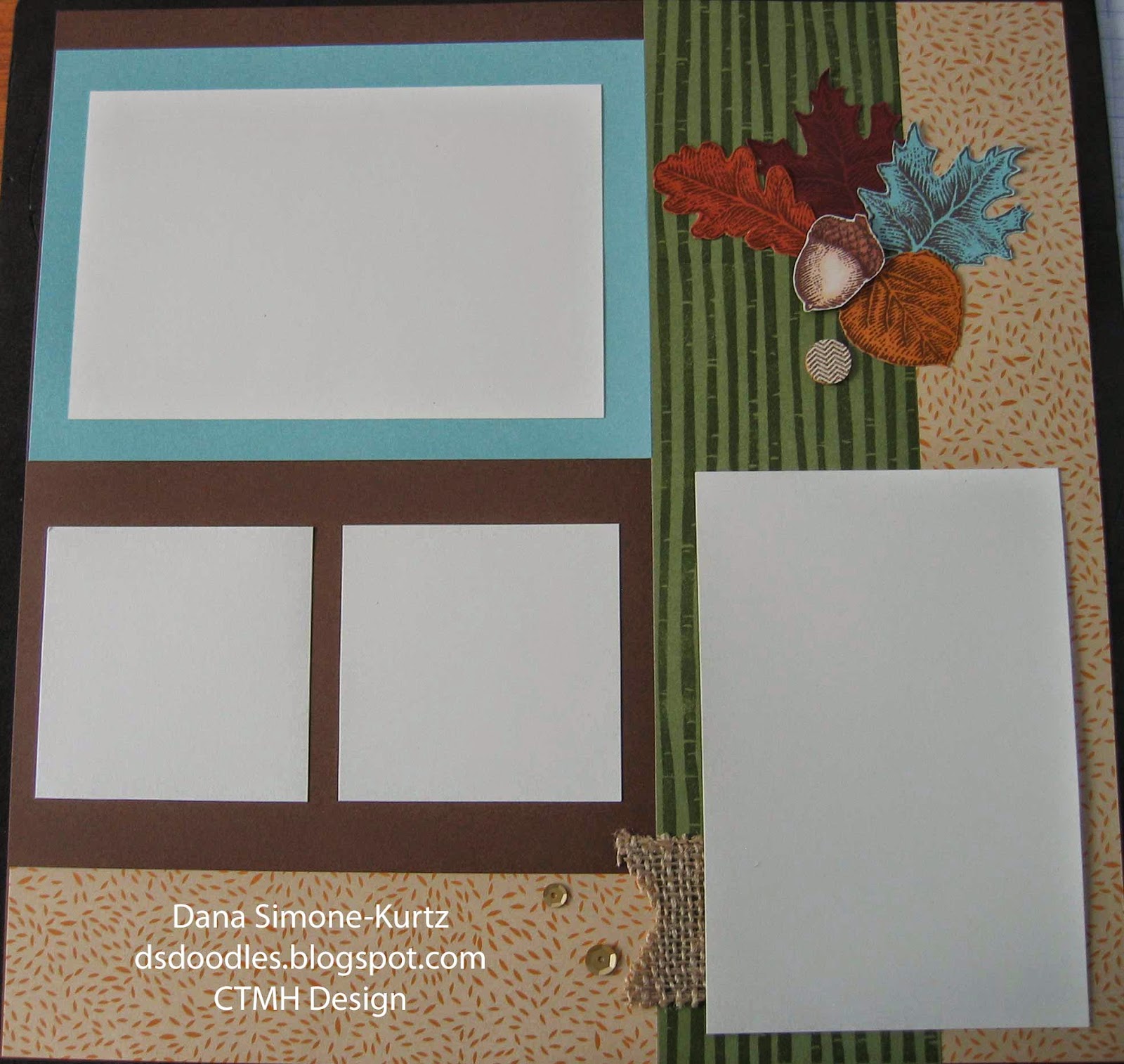


Final of Right page of Monologue
If you wanted to flip the papers over, they look good together as well.  I would recommend using lighter paper as the base though.  In fact, this kit almost came out with Champagne as the base.  I felt the leaves stand out more on this background, thus my completed project as shown. : )

Additional modifications you may consider... edge distress all of the paper with the edge distressor. That will add to the fall feel of the layout. You could sand under the title too.


The two large white papers represent 4" x 6" pictures, and the two small white papers are for the 3" x 3" pictures.


Some close ups.


Products used:
X7186B Pathfinding paper packet
X5770    Glacier Cardstock
X5637    Barn Red Cardstock
1243       Goldrush Cardstock
Z3012    Pathfinding Assortment
Z2012    Gold Assortment Sequins
D1604    Season of Thanks stamp set
C1504    Fall Harvest stamp set
Z2111    Chocolate Ink Pad
Z2137    Olive Ink Pad
Z2460    Pastel Pink ShinHan™ Touch Twin™ Marker (acorn base)
Z2445    Barely Beige ShinHan™ Touch Twin™ Marker (acorn base shading)
Z2456    Mahogany ShinHan™ Touch Twin™ Marker (acorn top)
Z2451    Clay ShinHan™ Touch Twin™ Marker (acorn top lines)
Z679       Liquid Glass
Z1836    Non-stick Micro-tip Scissors
Z1151    3-D Foam Tape
Burlap Ribbon (retired) – check the while supplies last supplies

Monday, March 31, 2014

Jubilee Archived Thank You

I loved this stamp set long ago when it was a rubber mounted stamp. I was excited to see Jeanette brought back some goodies in acrylics!

I paired the Flowering Thanks stamp set (Z1145) with Jubilee paper (X7181B) and Make it From the Heart Volume #2 together for this card.  Of course I think it turned out nicely!

Pattern #23 was followed for this card.  I colored in the Black inked (Z2105) stamp with our Watercolor Pencils (3505) for a nice soft look.  The upper right corner is adorned with Red Shimmer Tape (Z1848) cut at an angle, and I added Bitty Sparkles (Z1263) to the focal.  I didn't even need to think where to put them - I just followed the small circles Jeanette added when she drew this stamp.  :).  I finished the card by mounting the focal for some dimension and adding a brown sparkle to the potted flower's center.

Sometimes you'll see your sparkles coming off.  If that happens, just add a drop of liquid glass to the spot where the sparkle (or any accessory) is going.  Your sparkles won't be going anywhere after it dries!


Saturday, March 29, 2014

Happy Birthday Lollydoodle

If you're looking for a fun birthday card, look no further!  Lollydoodle is a bright, but not overwhelming, paper.  I think the colored circles make this paper look, dare I say, whimsical.

This card was super simple to make.  The owl, branch, and leaves from the Owls stamp set (B1450) was colored in with our Watercolor Pencils (3505) and cut out.  When stamping, I attached the leaves to the branch so I wouldn't have to cut those out separately.  I colored the owl's chest with the same colors as the background.  I randomly colored the feathers.

"Happy Birthday" (from Holiday Tags set D1560) was stamped in Chocolate ink (Z2111) - as was the owl and branch.  The leaves were stamped with Pear ink (Z2197).

I followed pattern #20 from Make it From Your Heart Volume #1 with the exception of the addition of the Silver Shimmer Tape (Z1799) in the upper left corner.  Those strips added just the right touch for me.

What else to say about the card?  The owl is mounted.  Enough.  : )

Wednesday, March 26, 2014

Timberline "Hello" Card

Today I thought I'd show you my masculine hello card.  This fun card is from Make it From Your Heart Volume #1 and is pattern #24.
If you  look at the pattern in the book, you might not recognize it.  I turned the pattern upside down!    The "hello" shape and stamp are from the Artiste Cricut Collection, as is the downward arrow.

All but the arrow and the base have been edge distressed with the edge distresser.  At first all I added was the "dot" after the salutation, but then I auditioned the triangular durables.  As you can see, they got the job!

Twilight and Bamboo ink were the two colors I stamped on the Colonial White cardstock.  And that's Creme Brulee behind the focal "hello".   Finally, the hello and the arrow are foam mounted to give the card some dimension.

Tuesday, March 18, 2014

Balloon Ride and Adrianna Cards

Want to know my favorite part of this card?  All of it!!  It doesn't always happen for me, but the cards I made while in Incline Village, Tahoe this February are some of my favorite cards I've made in a long time.  Sometimes I'm not able to create what I have in my head. 

But not this time!  The card looks better than it did in my head.  Let me tell you what went into making it.
First of all the colors are very soothing.  Balloon Ride features Cashmere, Colonial White, Creme Brulee, Crystal Blue, Juniper, Saddle, Sky, and Sorbet. This card uses just Creme Brulee and Saddle Ink.  The focal banner is from Banner Wishes (B1438) stamped in the two colors I just mentioned.  This Thank You card was created by following pattern #28 from Make it From the Heart Volume 2.

Other features of the card?  I sponged all the background and texture pieces with Saddle ink and added the durable stud triangles (obvious, Dana).  My favorite part of this card is that I mounted the bottom background and texture pieces with 3D foam so the whole card is elevated from the card base (Colonial White)!  And on top of that (literally), I mounted the saying!  Like I said, "LOVE it!"


This second card is not quite as high on my favorite list, but it, too, turned out like I visioned.
Balloon Ride and Adrianna paper packs were used here. This card is from Make it From the Heart Volume #1 and is pattern #28 (I modified the pattern accidentally).  The striped paper, according to the pattern, was supposed be adjacent to the Balloon Ride B&T center paper.  I liked the look (and couldn't get the paper up!) so it stayed this way.  : )  The stamp sets are Balloons (M1037) and Holiday Tags (D1560).

I'm going to interject here and tell you that it's been requested to include this card in the Spring Fling workshop scheduled on April 26th from 12:30 - 5pm.  Now you know one project!

Anyway, I colored the balloons in with colored pencils.  I stamped the balloons a few times before doing so.  Once for the base in Desert Sand (the string), once in Sky (blue balloon), and once in Sorbet (other balloon).  After I colored the balloons in, I cut them out and matched the colored balloons to the base balloons.  Just the balloons were mounted.  I glued the end of the strings down to the cardstock to give the balloons that much more dimension.  Finally, I mounted the "Happy Father's Day" piece as well.

The thing I like about this card is the versatility it brings.  Without even changing the paper, I can use a different saying from the Holiday Tags stamp set.  And, of course, by changing the paper and colors, I can make the card look different still.  The Brown Sparkles are the last touch to this card.