Showing posts with label Originals. Show all posts

Thursday, April 6, 2023

Originals - Background Blocks

The thing I like about this stamp is that is one large focal point.  It's easy to place on a card and be done.  Or, as with this card, add a tag for the saying (April Stamp of the Month - Sweet Tweet).  Then you're done.  Coloring the flowers can be zenful (is that a word?! to be full of zen; relaxing).  Find paper first, then color to match.  Or color, and find paper to match.

The stamp could be used to create background paper too - stamp tone on tone cardstock.  Cut that up, and you're good to go, especially with this Background Blocks pattern from the Originals cardmaking pattern book.


Saturday, April 1, 2023

Originals - Background Bar

I just got new stamps from the April - June 2023 idea book and played with a few stamps and some paper.  These two samples are from the Originals Card Making Program.  Background Bar pattern.  The pattern is for a 6"x6" card. 


Turtley Awesome + Thin Cuts (Z4696), Colored Pencils, April-June Mix In Paper with Mist, Seabrook, and White Daisy cardstock.  Rosemary ink was sponged around the two Seabrook pieces and was used for the saying.

Seabrook, Papya, Toffee, and White Daisy cardstock with more April-June Mix In paper; colored pencils, and Sweet Tweets - April Stamp of the Month


Thursday, July 27, 2017

All is Bright and December Word Puzzle

Here's another two samples (because I'm running out of days to show you).  One uses the Quick Cards - All is Bright with December Word Puzzle, and the other just December Word Puzzle.

Here, Sapphire is the base of the left side of this Originals - On the Left (page 21).  The All is Bright is again stamped in Sapphire ink on White Daisy cardstock.  The stamped image is then adhered to Pansy cardstock.

Sapphire ink was used with the December Word Puzzle on Willow cardstock.  I know, it's odd to have the green with the purple and blue - those are tertiary colors.

Not that fast!  Before you adhere any cardstock, you're going to take your sanding kit and sand the paper to reveal the white core.  Don't worry about the stamped words, you can sand them too.  By doing so, you bring in some white to soften the intensity of color (especially the Willow paper) and marry the white from the cardstock.

Gold Foil Tape separates the Sapphire and Willow papers.  And if you can see them, there are 3 Dream Big Glitter Gems on top of the Foil Tape.


This second card also comes from Originals (retiring at the end of the month).  Buckle (page 82), I think, was the perfect choice for this card.

The colors are Poppy, Ruby, Fern, Canary, and New England Ivy.

Before I continue, I'd like to point out what NOT to do.  And that is not pay attention to your drawn lines.  I'm sure you see my line to the left of "Holidays" is slanted.  Well,that's because I didn't pay enough attention.  Had I paid attention, the line would be straight and higher in the corner.

Now that that rant is over, on with how the card was made.  : )

Enchantment Fundamentals - New England Ivy is the background paper for this card.  The trees were stamped with Fern (the outside two) and New England Ivy.  The stars were stamped with Canary (there are three stars).  Then the stars were stamped on scratch paper and then colored in with Pastel Green.  Two were cut out and then glued onto the focal.  The trees were 3D Foam Tape raised on Ruby cardstock.  The two buckle parts are Poppy cardstock.  I distressed them with the direct to paper technique - love that look.

"Happy" is stamped in Ruby and "Holidays" in New England Ivy.  As I mentioned earlier, I drew a line with the Journaling Pen around the base of the card as well as the focal trees. The card was finished off with the Green Triangular Gems (I thought they looked like trees).

So there you have it... Two stamp sets that aren't in the idea books that are eligible for Stampganza event - buy 2, get 1 free!

Items Used:
Let it Snow
Item Number Description
A1148Quick Cards - All is Bright (Stampganza special)
D1313December Word Puzzle (Stampganza special)
X575Sapphire Cardstock
x5782Pansy Cardstock
X5784Willow Cardstock
1388White Daisy Cardstock
Z2848Sapphire Ink
Z3129Foil Tape - Gold
Z3321Litter Dreamer Glitter Gems (retiring 8/31?17
Z1294Sanding Kit (retiring 7/31/17)
Z11513D Foam
9036Originals (retiring 7/31/17)

Happy Holidays
Item Number Description
D1313December Word Puzzle (Stampganza special)
1388White Daisy Cardstock
X5927Ruby Cardstock
X5779Poppy Cardstock
Z3254Enchantment Fundamentals (patterns retiring 7/31/17)
Z2870Ruby Ink
Z2835New England Ivy Ink
Z2850Fern Ink
Z2843Canary Ink
Z2852Poppy Ink
Z2459Pastel Green Shin Han Marker
Z3223Enamel and Glitter Duos - Green Triangles (retiring 7/31/17)
Z1979Journaling Pen
Z2060Thin 3D Foam Tape
9036Originals (retiring 7/31/17)

Sunday, February 12, 2017

A Little Love


This little sample uses January 2017's stamp of month and Sugar Rush paper.  Sorry I didn't get this posted last month.  : (

A cute card either way for Tuesday.  : )  You can make it to go with yesterday's Ferrero Rocher Box project.


This little beauty is a 3" x 3" called Squares and Overlays (found on page 65 of Originals).  The three 1" x 1" squares on the left side are Raspberry, Whisper, and Blossom cardstock paper.  The Slate heart is made by taking the printed flower (stamped in Blossom above it) and turning it over to get a solid image.  Both hearts were cut out.  The Blossom heart was raised with Thin 3D Foam.  The Dreamin' Big sequin finish off the card.

Tuesday, November 8, 2016

Originals Swan Lake Thanks

How about Swan Lake paper?  What do you think of it?  Fall, masculine, and versatile comes to my mind.  Today and tomorrow I'm going to share two cards I made recently.

I wanted to make a card with Woodland Critters (C1657).  I really like the samples on page 23 in the Holiday Expressions 2016 supplement, with another critter.  Here is what came out:
Mr. Fox, stamped in Poppy (Z2652), cut out, and mounted with  Thin 3D foam, sits on top of a 4.75" x 3" card from Originals  - Diamond Duo.  The paper on the left is from Swan Lake (X7212B) Packet.  "Thanks" comes from the stamp set and was stamped first in Black (Z2105) for placement, and then in Whisper (Z2172) for fill in.  The edge of the White Daisy center diamond and the card edge was sponged in Whisper ink.  The center mat is Glacier cardstock (X5770).

If you're curious, here is the stamp set. It's available until Decembr 31, 2016.  See the outlined stamps?  Those correspond to the Artistry cartridge (retired).
What will you create?

Wednesday, October 12, 2016

Stamping Techniques Galore Cover

Here is the cover to my Stamping Techniques Galore class that I am teaching through the Poway Adult School.  This cover uses several techniques the students just learned.  Can you pick them out?

The cover is from Originals and originally measured 3.5" x 2.5".  The pattern is Double Duty and is on page 113.  I modified the pieces to fit my 4.25" x 2.75" front.  The black is 2.75" x 2.75" and the background texture paper is 2" x 2.75".   Colors are Lagoon and Peacock for the flower and Sweet Leaf for the stem.  Black was used for the word.  : )

During the first class, we covered 22 of 40 techniques.  Saturday we'll finish the remaining 18 techniques and make a card incorporating those.

As you can guess from the picture, each technique gets it's own sample that is connected with the ring.  Students don't just hear me talk about the technique - they do the technique.  The sample has instructions on how it's done for future reference.

It's going to be offered again in late January if you're interested at all.  Sign up through powayadultschool.com starting November 8th.

Did you figure the techniques out?  They are traditional stamping, layered stamps, masking, stamping off the edge, and fading - generation stamping.

Friday, June 10, 2016

Softball Thank You Cards

Recreational softball ended a few weeks ago.  Cards were needed for the team party.  Surprisingly, I had an idea of what I wanted them to look like.


Would you like to guess our team color?!  I did have to keep the softball in true color.  : )


These are 6" x 6" cards and come from Originals.  The pattern is called Side Focus and can be found on page 23.


I really like the industrial look the staples brought to this card.  The cards are for male coaches, so I thought it was a good addition.

This card is for the head coach who put the most time into coaching.  I wanted to set it off from the other two.  I did that with the Whisper cardstock replacing the Black cardstock.  I also added the simple word, "Many".  Simple changes make a statement.


Wednesday, April 27, 2016

Color me Dare #190 Meets Happy Times Stamp Set

Double bonus post today!  I'll get the timing down someday.  : )

I want to share my Color Dare from this week.

The month of May is National Scrapbooking Month!  At Close to my Heart, we have a special paper packet and stamp set to celebrate.  My color dare capitalizes on the stamp set.  : )

I'm not going to lie, I struggled with this color combination.  Having to use all and only was the tough part for me.  The Ruby and Colonial White threw me off...

This card is a modified Three is the Charm from Originals how-to program.  In Originals, the card measures 7" x 5".  I shrunk the measurements for this 5.5" x 4.25" card.  : )

Adventure Fundamentals paper ((Z3125 - Gypsy) and Penelope Paper packet (X7207B - available until April 30th!) frame the three focal flowers.  Pear unifies the three colored flowers.  And the saying, stamped in Ruby, brings a little more balance for that color.  "just because" (from the hostess reward stamp set Say it All) is flanked by the Red Enamel Gems (Z3090).  The picture doesn't show it well, but the white is actually colonial white!

Tuesday, January 26, 2016

Decisions?!

I hate my job, sometimes!  Let me tell you why... And I should start with the fact that it's not a horrible problem to have.  Well it is when a decision needs to be made!

So, I'd been working on my birthday goodie cards and got to the Bandwidth card.  The plan was to emboss the base of the card and assemble.  First problem was deciding which side to have face up - the center of the design or the outline of the design (top left vs bottom right).  Next was the decision of the focal point.  Do I leave a little bit of border or more (top two vs bottom two).  After I couldn't decide which was better, I then thought of backing the base with Black cardstock to mimic the focal (top right and bottom left vs the other two).

So I made four of them and laid them all out.  Technically I should have made 12 more - one for each of the decisions, but I didn't have the time.

Do you see my PROBLEM?!  Having to make these types of decisions is just exhausting sometimes!  I didn't even have family members around to help with the decision.  And the WORST PART is I STILL CAN'T DECIDE!!

I did make a decision, but you'll have to make one too, if you receive this card as your goodie card.  You'll have to decide which embossed part goes upward.  All I have to say is, "Good Luck!"  : )

Saturday, December 12, 2015

6th Grade Camp Card 4 of 5

Today's camp card was inspired by the color Pacifica.  It is one of the colors from the Kaleidoscope paper packet, but I wasn't happy with what I had in my mind with any of the background and texture papers.  Finding the Words ( D1646) was the only stamp set used for this card.

Bandwidth is the pattern, came from Originals, and is on page 31.

The Pacifica cardstock background was distressed by lightly rubbing (in a circular motion) the Pacifica ink pad on the cardstock.  In fact, all of the distressing was done with Pacifica ink.  The Lagoon band with "Love" and the two squares (Sweet Leaf and White Daisy)  are sponge distressed.

The hearts were stamped in the three colors of the card - Sweet Leaf, Lagoon, and Pacifica.  They are placed on the card to stand out.  It wouldn't have looked as good if I put the Pacifica heart on top because it wouldn't stand out as much, just like the Lagoon heart wouldn't being on top of the Lagoon  band.

Friday, December 11, 2015

6th Grade Camp Card #2

This card is what Amber opened today.  I explained inside that this is the best day ever for us because we get our baby back (insert sigh)! - in a couple of hours as a matter of fact!


This is from Originals and is called Squares and Overlay (found on page 65).  The Background and Texture paper is from the Kaleidoscope paper packet.  The Thistle cardstock is not part of that paper packet, but coordinates.  I edge distressed that paper with the direct to paper technique (I swiped the ink pad directly to the paper).

I used a flower from Blossoming Expressions (D1665).  I have found that I use that set a bunch.  : )  Oh, the flower color isn't part of the Kaleidoscope scheme either.  That flower is stamped in Sorbet with a Smoothie outline.  The leaves are Sweet Leaf with Pear outline.

Sunday, October 18, 2015

Watercolor Pencils with Fallen Leaves

Want to see the difference between the watercolor paint and watercolor pencils?  I wanted to see the difference with my latest card -- I talked about it the other day.

Here is the watercolor pencil version of the Three is a Charm (modified from Originals) card...
After I embossed the leaves with Gold embossing powder, I took my watercolor pencils and colored the leaves.  Purples and Greens for the one on the left.  Yellows, Oranges, and a little Red for the middle leaf.  And Purples and Pinks for the leaf on the right.  Then I took a paint brush with a little water on it, and blended the pencil marks together!

Did you go look at the other card yet?  Can you tell the difference between the two?  Here, look at them side by side (I'll even make the picture bigger)...
You can't really tell the difference, can you?  I even had a hard time telling them apart!  The back card is the watercolor PENCIL card.

So why am I showing you this?  Because you may want to give those pencils another try.  The thing I like about the pencils is that I put the color exactly where I want it.  If I want more color, I layer the pencil more.  Then I blend it with water, and I get beautiful colors.

However, the watercolor PAINT colors can be more natural because there is more color variation as the brush dries and I'm applying the color.

Will I give up one for the other?  NO WAY!  Both methods have their advantage.  For this card, I love the look either way!


Sunday, October 11, 2015

Fallen Leaves with Sangria


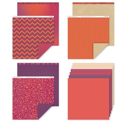
I'm in love with Sangria paper now that Fall is here.  It's as if the leaves have fallen off the trees and landed on the paper (shown is the paper packet papers when you order X7199B which consist of 6 sheets of background and texture paper - 2 each of 3 double-sided designs - and the cardstock)


Another of my fall favorite stamp sets is Fallen Leaves (B1492).  Once upon a time we carried a similar stamp set (wood mounted) that I loved.  When I saw this stamp set, I had to have it and relive my "youth" - updating a card from my past.  But that's another story...


Today I thought I'd share a card that made me very happy,

The leaves were heat embossed with Gold Embossing powder and then heated with our Craft Heater.  I then colored the leaves with watercolor, cut them out, and mounted them.  Three is the Charm card pattern from Originals (pg 19) was modified for a standard 4.25" x 5.5" card instead of the 5" x 7" card in the book.

The paper is one of the background and texture papers from Sangria.  The other cardstocks are Cocoa, Desert Sand, and Cashmere.  "Thinking of you" is from the hostess Reward set Say it All (C1632) and was heat embossed in Gold Embossing Powder to match the leaves.

I hope you're happy now too!

Wednesday, September 30, 2015

Sample for National Stamping Month

Another last call, this time for the National Stamping Month Stamp Sets.  You would have seen this card on my facebook page if you follow it.

**go ahead now, and "like" my page so you can get sneak peaks of things that get explained here.  Go to facebook.com/dsdoodlesCTMH and in the header you should be able to like my page! **

Anyway, here is a card I made using the Scrapbooking stamp set.  There is nothing on the set that says, "Only use with Scrapbooking!"  Each of the stamp sets, as a matter of fact, have their strengths.  You could be very happy with any, and all, three of the sets.  I showed the sets in an earlier post, so I won't show it again.  I'll just show you the purty card.  : )

Originals - Delightful Dots pattern is what I based the card design around.  I really like how the colors of Nevermore paper work and compliment so well.  I even colored the Silver Sequin to bring a little more color to the card.  What did I color with?  With our Lavender ShinHan Touch Twin Marker (Z2453).

These stamp sets are going away in mere hours.  Don't procrastinate and miss out.  They are going, going, gone at 10:59pm (PST) on September 30, 2015.

Friday, September 18, 2015

Card Using Paper Garden

Now that you've been impressed with corporate's stamp of the month samples, I want to show you mine.  Oh, wait, maybe I should have done it the other way around!

Simple and elegant - this 3.5" x 8" card is from Originals and is called Top View.  The pattern can be found on page 86.


I rotated the Paper Garden (S1509) image to the orientation shown, stamped on the Colonial White in Cocoa ink, and then stamped it again on scratch cardstock.  I cut out the main flower to emphasis it that much more.  The focal flower was matted on Desert Sand - Champagne is also a good choice - and layered on Sangria (X7199B) paper.  The Flaxen Extra Thick Twine (Z3036) is two pieces - one for the bow and one for the line.  I used Liquid Glass (Z679) to adhere the twine.

Finally, I added "thanks" to the bottom of the card in Cocoa ink (Z2114). Can't find the font under fonts section of the book?  Check out page 137 under the Base and Bling section.  The stamp set is great to monogram your necklaces.  But it also works well for cards!  The stamp set is called Etched Alphabet (A1182).

Tuesday, August 4, 2015

The Girls' Camp Cards


I mentioned on my Facebook page that my girls went to camp for the week.  They wanted to have their cards for the week with them because they don't always get it in the mail (something about the girls not passing it back to them).  Anyway, I procrastinated making the cards - I only had months!  The good thing, though, is that since I waited, I got to use Zoe paper for the cards.

I took my Originals how-to program, one sheet of Zoe, and the coordinating papers (Slate, Whisper, Sorbet, Sweet Leaf, Glacier, and Daisy White).  Looked at the "at a glance" section of Originals, and cut my papers.  All the cards are 3" x 3".  Perfect for a little note.

I didn't do any extra "work" on the cards.  No distressing (even though some could do with it). 

Stage Right page 122


This first card uses a punch of color with the Pacifica flower.  The flower and the leaves (Juniper) were Cricut Cuts from the Art Philosophy cartridge.  You can see that you're not restricted to the colors on the zip-strip of the background and texture paper.  The center of the flower is sporting two sequins from the Silver Sequin package (Z2013).  When it still needed something, I took out my Mini Stapler (Z2027) and wham!  I love those staples (first time on a card - definitely not the last time)!


Package Deal page 124

I knew I wanted to make 3" x 3" cards, but I fell in lust with the 6" x 6" design of this card.  No worries, I just divided the measurements by 2".  The butterfly and saying are from Your Own Kind of Wonderful (D1627) stamp set.  I colored the butterfly with Peacock Green (Z2461), then removed some of the color with the Colorless Blender (Z2469), and then added Turquoise Blue (Z2465) and a touch of Light Orange (Z2455).  The dots are colored with Pastel Green (Z2459).  To prop the wings, I cut very small slivers of Thin Foam and put them on either side of the body.  Flaxen Extra Thick Twine (Z3036) finishes off the card.


Close up of Butterfly


I fussy stamped the You are Loved part.  That saying is on one straight stamp.  I carefully inked the "Loved" on the inkpad (the very corner).  If any ink got on the other words, I would have wiped it off.  Then I stamped "love", cleaned the stamp, and repeated the process, being careful not to ink the "loved".  Perfect!


Triple, Triple page 12


These are basically the same card.  I just doodled a little differently on the two.  This card reminds me of a retro beach.  The retro comes from the colors - Glacier and Sorbet.  The beach is from the flowers, which came from Happy to be Friends (C1605).  The "for someone" and "special" come from the set Finding the Words (B1646).  I added a little bling on the flowers from the Brown and Tan Sparkles (Z1753 - going away at the end of the month).  The center strip has been raised with 3D foam.


Here is a close up of one of the cards:


Squares and Overlay page 65


Next up is this diddy.  If you wanted to, you could add some ink to the Whisper paper on the right.  But here you can see what clean lines look like.  The pop of Sorbet color of the flower just makes me smile.  The flower and the saying are from the stamp set Have a Happy Day (D1616).  That stamp set and these colors make me so happy, that's what this month's workshop is going to feature!  The flower is raised with 3D foam tape.


Center Focus page 110


Last but not least, is my Hello card.  The stamps are once again from Have a Happy Day (D1616).  I used another pop of Pacifica for the flowers.  The center image is first generation while the other two are second generation.  In this large picture, I added tone on tone chevrons to the band.  The below picture is the with and without that stamping.  I still don't know which one I prefer!  The chevrons needed to be the same ink color as to not compete too heavily with the background paper and make you want to barf.  Because it is subtle, I believe mission accomplished.
 
two versions of the same card


So now the girls will each get there own set of cards.  Mike and I wrote something for each day.  I can't wait to explore more!  Hopefully I'll remember to pick the girls up at the end of the week.  : )


Tuesday, February 25, 2014

Simple February Stamp of the Month Card Sample

February 2014's stamp of the month (SOTM) can be dressed up or down.  In this sample I've made a very simple card.

 Here are the images for the stamp set.  In my sample above, I took the small heart and randomly stamped the top of my card.  In fact, this card is "Lucky Layers" (although modified) from Originals how-to program.  The paper is from Skylark.  The inks used are Sweet Leaf, Chocolate, and Cranberry.  This card can be sent to a friend or spouse.


Here are a few more samples from Corporate.  Most of us know the saying "Wild thing, I think I love you" from the movie Major League!  "Wild Thing" is a great stamp to set you up for that saying as demonstrated in the picture layout.  It can also be used with the kids, because we all know they can be wild at times!


Same rules apply... this stamp set is only available until February 28th, 2014.  You can purchase it at the regular retail of $17.95 or it will be yours for $5 when you purchase subtotals to $50.  You shouldn't have any problem finding $50 to spend on this new Spring/Summer idea book.


Wednesday, February 19, 2014

Cookie Cards


Southern Californians know that we are in the middle of Girl Scout Cookie Sales.  Even "worse", we're in the middle of booth sales which means there are girls in front of most grocery stores (in San Diego the last booth sale is March 8th, and cookies are gone March 15th).  Lindsey, as a Cadette (6th grader), has lost the "Oh, how cute!  Of course we'll buy cookies from you!" factor.  To compensate and help drive our booth sales of February 13th and 14th,  we marketed Valentine's Day.  To help entice customers to buy cookies for the day, Lindsey and I made these three 3"  x 3" cards.

Old papers and old stamps, but cute!  These three styles come from Originals How-to Program.  The "Love" card was the most popular.

Update the paper and stamps:  I'll try the Oodles of Doodles (B1449) for the sayings and Owls (B1450) for the older stamps.  Now it's your turn!

Sunday, January 26, 2014

Create Your Own

I made this card in 2008.  Why am I showing it you now?!
Originals: Center Accent - 4.75"x3"
Because it shows several techniques!  First off, there are only two colors of cardstock associated with this card -- Spring Iris and Vanilla Cream (both retired).  The words are from one stamp set, the balloon is from a second stamp set, and the background pattern is from third set. 

The first technique is creating the top part.  I took the different birthday wishes and placed them all on one block.  I wanted to have "celebrate" and "happy birthday show" so I placed them on the block accordingly.  I stamped in Spring Iris on the top of the card.  Done.

Second technique is creating the background bottom portion of the card.  I wanted the card to be monochromatic and there wasn't any background and texture paper suitable.  That's why I stamped the bursts!  If memory serves me, that was one stamp for the whole bottom.  If not, then I stamped it multiple times.  Bottom done.

Third technique is a fun one. The balloon kissed the background stamp!  First, I inked my background burst stamp in Desert Sand and set it aside briefly.  Next, I took the balloon and created a second generation (ink stamp and stamp once on scratch paper).  Then, I kissed my second generation ready balloon to the background image.  That's to say, I stamped the background onto the balloon.  And finally, I stamped the balloon onto paper.  Therefore, my image was a balloon with a background on it.  Pretty cool, huh?!  Finally I stamped the balloon string in Desert Sand, cut out the balloon and the string, and edge distressed the card and the balloon.  The edge distressing technique was direct to paper.  I took the ink pad and swiped the paper's edge along the edge of the pad.  I sponged the balloon.

I assembled the card and mounted the balloon as the focal, and done!!

Can you use these techniques with the stamps you have currently?  You bet!  Will you look at future stamp sets and paper with these in mind?  I sure hope so.  : )

Friday, June 8, 2012

April 2012 Workshop Thank You Note

My April 2012 workshop featured Lisa Stenz's card box and my cards.  We used Pemberley paper and the Card Word Puzzle stamp set for the workshop.  To follow up with those themes, I created a 3"x3" card for those who ordered from me.

Originals: Stage Right
This card came from Originals card confidence program (I LOVE this tool) on page 122.  The card base is Olive cardstock with Desert Sand providing the strip.  The flower is stamped with Outdoor Denim on Colonial White and colored with our watercolor pencils.  The leaves are stamped in Olive on Garden Green cardstock.  "Just Because" is stamped in Outdoor Denim and comes from Card Word Puzzle.  The edges are distressed by direct to paper with the corresponding cardstock ink color.

How do I do direct to paper?  Open your ink pad and directly swipe it against your paper.  Depending on the angle you hold the paper (or ink pad) will determine how much ink you get on the paper.  Remember my May stamp of the month sample?  I rubbed the Olive ink pad along the entire paper to achieve that look.  You should try it!